Basic Color Theory for T-shirt Graphics
Not everyone can be clever enough to come up with a single phrase that is original, clever or compelling enough to stand alone on a t-shirt and sell by the truckload. Wouldn’t it be nice if we could just push a button and churn out hundreds of black t-shirts with brilliant catchphrases in white type (I’m looking at you, social media scammers selling get-rich-quick AI schemes)?
For the rest of us, we have to rely on, oh, good design skills. Notice I didn’t say talent. Skills can be taught. So don’t think that if you’re not a born designer or never went to design school, you can’t create attractive, saleable designs.
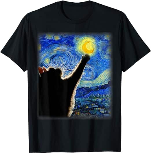
In fact, with just the knowledge in this piece, you’ll be miles ahead because graphic tees – t-shirts that feature designs with or without an accompanying phrase or logo – have always dominated. All you need is a little knowledge about color.
Also, in the t-shirt world, the product IS the advertisement. Unless referred to by a contextual ad, it’s the one thing that will grab your customer’s attention.
Most of my work is in retail product development. I’ve been teaching for decades what I call the “20-foot rule”: a product should do two things from across the space of two aisles in a large retailer or across the floor of a smaller one:

- Grab the customer’s attention
- Promote its purpose clearly and compellingly
Given that the e-commerce thumbnail would appear to be the size of an average product when viewed from about 20 feet away in a live setting, the same rules I’ve taught in the past are even more pertinent today.
PUTTING THE POWER OF COLOR TO WORK
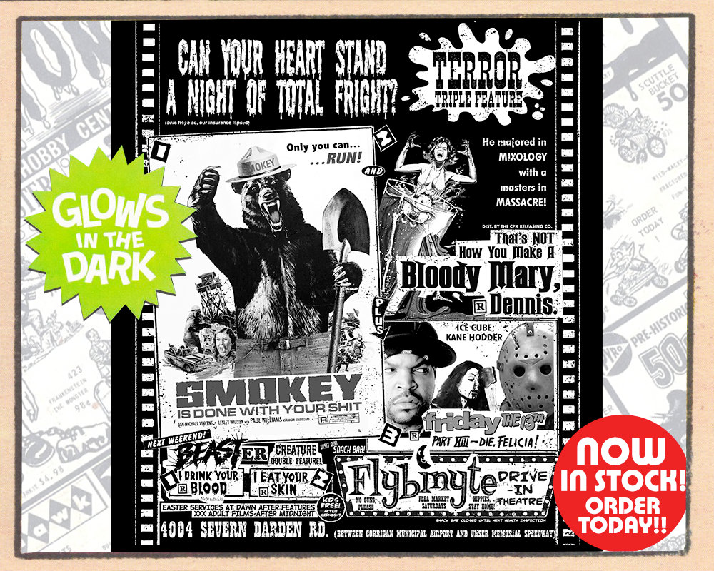
Your designs don’t have to be complex or detailed to be effective. A simple design with just a few chosen colors will impact the eye more effectively than a busy image. The below image is a perfect example of a busy design that won’t sell because all the jokes are buried within it. The designer clearly forgot everything he knew about what works on a t-shirt versus an art print (yes, said designer is me).
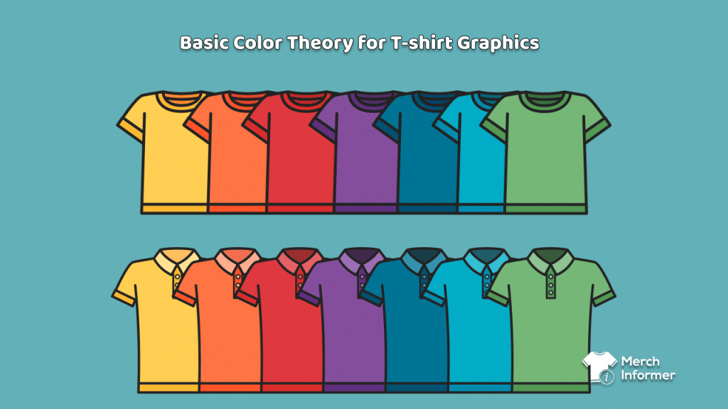
The critical elements to consider are the color of the shirt itself and the print colors of the design. Think about how the combination of colors complement or contrast on the finished garment.
Contrast Is Critical
The easiest rule to remember is “opposites attract”. If you want people to see what’s on the shirt without straining their eyes, contrast is most important. So, if a shirt color is dark, best print with a light color. If a shirt is a light color, then print dark. Don’t be fooled by what you see on your computer monitor – it’s backlit, so it doesn’t give the most accurate idea of contrast if the two tones are too subtle.
The Basics of Color Theory and How They Apply To Garment Design
Chances are, you’ve bought a t-shirt because the design was something you liked or something that made you feel good. That was a successful sale because someone designed the shirt using color theory.
The Definition of Color
Color is all about light waves on the electromagnetic spectrum and how they are perceived by the human eye. Visible light is only a single aspect of the radiation put out by the sun.
The sun’s light is a mix of all of the colors of the rainbow (which is why a rainbow is formed when sunlight is refracted through mist or the cover of a Pink Floyd album). We perceive different colors because of how they are reflected back when light hits an object decorated with that color. Every color hits that object, but the chemical makeup of the surface it hits will only reflect back certain colors.
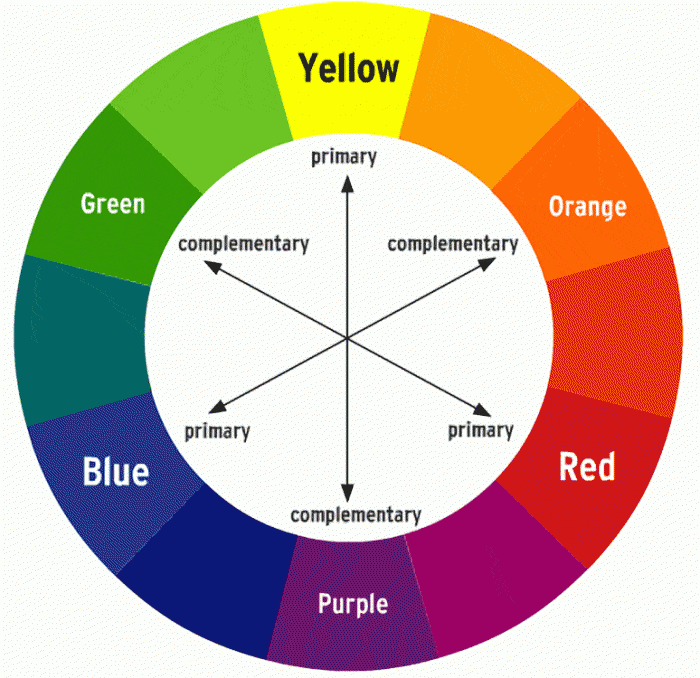
The Color Wheel
When that apple bonked Sir Isaac Newton on the head, he not only came up with the theory of gravity, he also developed the concept of the “color wheel” – the relationship between the different colors of light on the spectrum. You may remember the “primary colors” from kindergarten or elementary school – red, blue and yellow – and how different combinations of them make any other color. Red and yellow make orange, yellow and blue make green etc. All the rest of the colors of the color wheel are “tertiary colors”.
Color Types
Imagine the t-shirt as your canvas. Whatever color you select for your t-shirt is the background for all of your work, so selecting print colors that work with your shirt color will give impact and appeal to your design.
Monochromatic Color
Simply put, these are shades of the same color. Instead of contrasting colors, you’re contrasting different versions of the same color family – this works best with complex designs as it keeps the design clean and easy on the eye.
Analogous Color
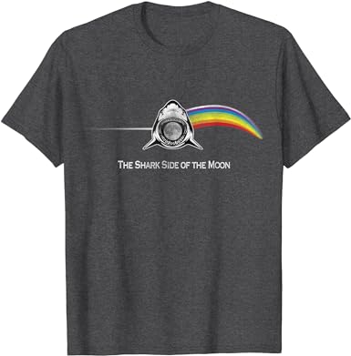
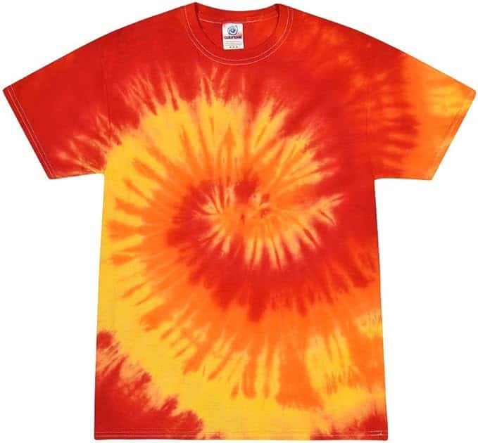
This is the use of combining colors that sit next to each other on the color wheel. It’s an effective way of making designs pop without looking too loud. A good example is using adjacent mixes of colors that include red, like pink and orange or purple and orange.
Complementary Color
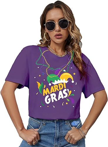
This is one of the easiest to select if you’re stuck on color ideas: it is the use of colors on the direct opposite of the color wheel, like purple and gold (Mardi Gras colors) or orange and dark blue (the colors of my long-suffering New York Mets).
Graphic tees have been a mainstay of casual wear since at least the 1970s. And having lived through them I can tell you that there were some butt-ugly color combos that must have done well because all the kids were wearing them. And now, apparently those same designs that remind folks like myself of cheap beer and recently snuffed cigarette butts are considered “retro chic” – so, be bold! Put a burnt orange striped sunrise against a brown mountain range on a yellow t-shirt and attach a high price tag on it – the hipsters will buy it because its “cool” or “vintage” even though it would have sold for five bucks in the Sears catalog during the Ford administration. Armed with a solid knowledge of color theory, you can take a simple idea and make it pop!