Currently browsing: Design

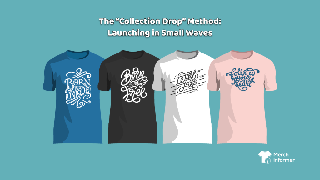
The “Collection Drop” Method: Launching in Small Waves

There’s a particular kind of exhaustion that hits POD sellers who are doing everything “right.” You’re designing. You’re uploading. You’re posting consistently. You’re trying new product types. You’re tweaking keywords. You’re staying busy. And yet it still feels like you’re throwing paper airplanes into a hurricane. That feeling usually has nothing to do with your creativity. It has to do with how you’re releasing your work. Most POD sellers launch the way people clean their closets: in a frantic weekend burst where everything ends up in piles, nothing has a label, and by Sunday night you’re sweaty, annoyed, and not sure anything actually improved. A Collection Drop is the opposite. It’s a calm release strategy that makes your shop feel […]

Read more

The Variant Strategy: Colorways, Roles, Editions – Without Looking Spammy

If POD had a “silent killer,” it wouldn’t be competition. It would be self-inflicted clutter. Because the moment you find a design that sells, a very human thought shows up: “Great. Now I should make a bunch of versions.” And you should—because that’s how catalogs grow. But there’s a line you don’t want to cross: the moment your shop starts to feel like an endless hallway of the same listing wearing different hats. Buyers get tired. You start competing with yourself. The shop stops feeling curated and starts feeling noisy. A strong variant strategy avoids that. It scales what works while keeping your storefront feeling intentional—like a brand, not a slot machine. To do it right, you need to be […]

Read more

One Design, Many Stores: How a Single Upload Workflow Changes the Game

POD doesn’t get hard because design is hard. POD gets hard because repetition is hard. The part that burns people out isn’t making one good design — it’s doing the same “admin loop” over and over: upload again rewrite the same listing again re-enter keywords again re-check variants again track where you posted again That’s where creators quietly stall out. And it’s sneaky, because from the outside it looks like you’re “doing the work.” You’re busy. You’re posting. You’re tweaking. You’re optimizing. But inside, the energy drain feels like this: “Why does this take so much effort for so little output?” That question is the beginning of burnout. A single-upload mindset changes everything because it shifts POD from “random posts” […]

Read more

The Collection Strategy: How to Turn One Design Into a Mini Product Line (Without Bundling)

one design multiple products

A lot of creators hear “increase your average order value” and immediately think bundles. Bundles can work… but they also add friction: more decisions for the buyer more complexity in listings more chances for your shop to feel messy and (depending on the platform) more limitations than people expect The good news is: you can get most of the upside of bundling without bundling at all. The secret is the collection strategy—turning one design idea into a cohesive mini product line that feels intentional, giftable, and easy to shop. A collection doesn’t force the customer to buy multiple items in one checkout. It simply makes it natural for them to want more than one thing. Let’s break down how this […]

Read more

Design Once, Version Many: Smart Variations That Don’t Feel Like Spam

design once

One of the fastest ways to burn out in print on demand is trying to “scale” by brute force: more designs, more ideas, more uploads, more everything. That approach works… right up until it doesn’t. The creators who last—and who build catalogs that actually look professional—usually scale a different way: They design systems, not one-offs. They take one strong concept and create smart variations that feel intentional, collectible, and coherent… not like copy-paste spam with a different color slapped on. This post is about how to do that—without becoming the person who uploads 47 near-identical listings and wonders why nothing converts. Why variations work (when they’re done right) Variations aren’t a shortcut. They’re a way of meeting real buyer behavior. […]

Read more

Work Humor: Work-From-Home Memes on Totes & Sweatshirts

work from home meme shirts

Design-forward strategies for Merch by Amazon creators, with winter timing in mind Work-from-home humor hits a sweet spot: it’s relatable, giftable, and endlessly refreshable. As temperatures drop and Q4 gifting ramps up, cozy sweatshirts and practical totes become the natural carriers for jokes about meetings, coffee dependency, “camera off” days, and the eternal battle between productivity and pets. In other words: winter is peak season for WFH meme merch. Below is a design-heavy playbook for building a whole quarter’s worth of tote and sweatshirt collections that feel witty, current, and genuinely wearable—while staying inside Merch by Amazon guardrails and avoiding brand/IP landmines. We’ll keep tool talk light and focus on what to design and how to design it well. 1) […]

Read more

Y2K & Retro Nostalgia: How ’90s/2000s Aesthetics Drive Merch Sales – Geometric shapes, pixel art, and vintage textures across T-shirts, PopSockets, and posters

y2k retro nostalgia designs

Y2K is back—but not as a gimmick. The late-’90s/early-’00s mix of bold geometry, pixel graphics, plastic-gloss textures, chrome gradients, neon, and grungy grain is the perfect recipe for merch that pops in thumbnails and delights IRL. 2026 design rundowns consistently call out pixels, simple shapes, retro/retrofuturist vibes, and textured grain as mainstream visual directions—exactly the ingredients of ’90s/2000s nostalgia. At the same time, nostalgia and retro-futurism are explicitly flagged by major creative trend reports as rising forces in 2026—a tailwind you can ride with confidence. And beyond apparel and grips, posters and wall art are having a moment in home decor, with Y2K-leaning looks (neon, chrome, playful motifs) called out as surging—great news if you add posters to your mix. […]

Read more

Top Design Trends for Kids and Family-Oriented Products in 2025

design trends for kids

1. Retro-Inspired Cartoony Aesthetics Designs inspired by 80s and 90s cartoons are having a moment. Bold, blocky fonts, bright pastel color palettes, and exaggerated expressions are all in. These visuals evoke nostalgia for parents while still appealing to kids. Design Tips: Use MerchInformer’s Trend Hunter to search terms like “retro kids shirt” or “vintage cartoon family.” Add wacky faces, boom boxes, and neon swirls for that throwback appeal. 2. STEM and Learning Themes Educational t-shirts and journals are increasingly popular, especially for homeschooling families or teacher gifts. Think science, math, coding, or reading. Examples: “Girls Code Like Queens” “Reading is My Superpower” Tools to Use: MerchInformer’s Keyword Finder helps you identify low-competition variations of terms like “STEM for kids” or […]

Read more

Tapping into the Gamers Market: Design Ideas for Video Game Fans

gaming merch

The gaming industry has exploded into a cultural and commercial juggernaut, with millions of players across every continent, and billions of dollars in annual revenue. But it’s not just AAA titles and esports leagues making waves—video game fandom has evolved into a full-fledged lifestyle. From nostalgic retro players to next-gen console warriors, there’s an ever-growing audience hungry to express their gaming identity. For Merch by Amazon sellers, this is a golden opportunity. By leveraging the tools in Merch Informer, you can research, design, and launch t-shirts, hoodies, and other apparel that tap into the heartbeat of the gaming community—without ever infringing on intellectual property. Let’s explore how to do it right. Why the Gamers Market Is Worth Targeting Before diving […]

Read more

Stained Glass (Prism) Aesthetic: What It Is, Why It Charms, and Where It Belongs

stained glass prism design merch

A very short history Stained glass began as storytelling in light—colored panes separated by dark “leading,” arranged as rosettes, arches, and patterned windows. Over centuries, it moved from cathedrals to townhouses, train stations, Art Deco theaters, and mid-century door panels. The constant: bold compartments of color that read from far away and feel a little magical when light meets geometry. What it feels like Luminous calm: rich color without chaos; the dark “lead” lines keep everything grounded. Craft energy: it hints at handwork and tradition even when the art is digital. Order + emotion: geometry gives structure, color brings mood. Where you see it (past and present) Heritage: church windows, Victorian door transoms, Deco foyers, transit halls. Design & decor: […]

Read more