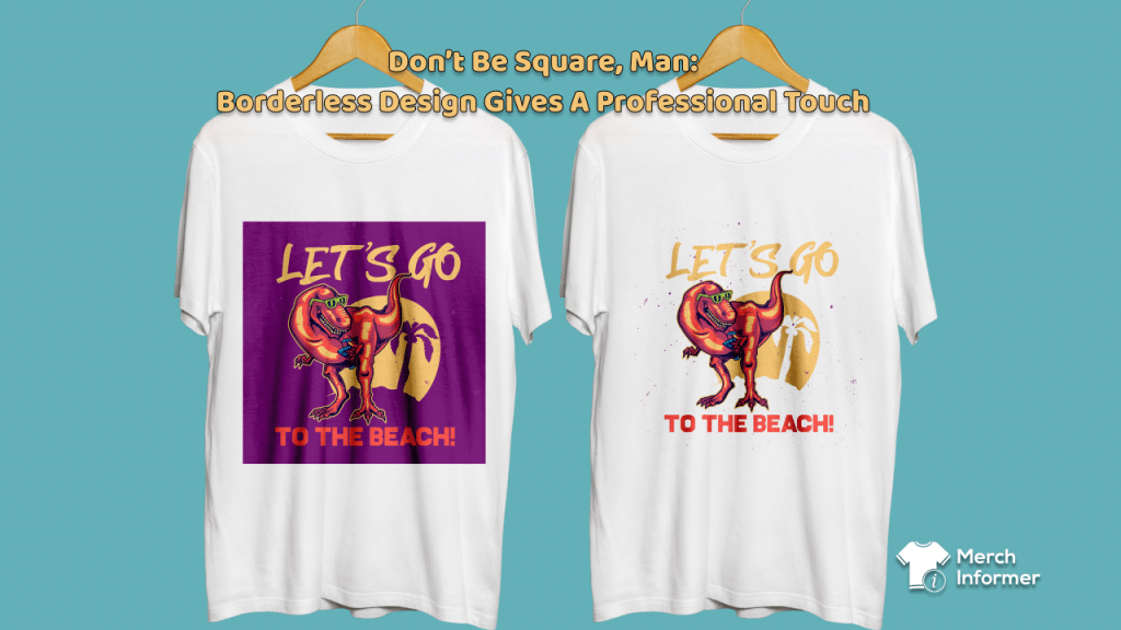
Don’t Be Square, Man: Borderless Design Gives A Professional Touch
Those of us who were around during the early days of print-on-demand remember how poor and amateurish the quality was. This was mostly the result of the limitations of the equipment available at the time. Pull-down heat presses with limited printing space produced brittle, blurry, washed-out prints in letter or legal-sized squares.
Even if the designer was creative enough not to limit their idea to the confines of the space, the shiny texture of the printing paper virtually cried out “THIS WAS PRINTED AT HOME.”
Today they call it “vintage”, we used to call it “cheap-looking”
Modern print-on-demand technology has vastly improved, and in the Amazon Merch-On-Demand world, designers are regularly producing product that rivals any large apparel brand. In fact, many brands have been created through Amazon MBA from home-based enterprises.
Besides the quality of the printing itself is the freedom with which designers can create professional looking designs.
The only challenge that remains from the early days of POD is the size/location of the imprint area. You can’t do an all-over print (AOP) for example – on a simple t-shirt, you are still limited to a maximum size of 4500px by 5400px.
The good news is that the quality of the printing is so good that the “box” that would show in previous heat-transfer garment prints is gone.
So, it’s time to think outside this “box”.
NOW YOU SEE IT…BECAUSE YOU DON’T, REALLY
Just because you have a box-like area in which to print does not mean you are bound to print all the way to the edge or use a frame to enclose your design.
Leaving a lot of empty/negative space or eliminating borders altogether gives the viewer the impression that there is actually more to your design than just the print itself.
Let me explain with a story.
Years ago, when I was involved with the “Star Trek” shows of the 1990s, I was treated to a tour of the various sets of the U.S.S. Enterprise NCC-1701D by one of the art directors. It was the first time I had ever been on a genuine Hollywood set, and I was surprised at how small and compact everything was. The bridge, the cargo bay, Engineering – all sizable or sprawling spaces on TV – and this was long before CGI and digital backgrounds – were just well-constructed bits of wood and plastic, but dwarfed by the cameras, sound and lighting equipment that surrounded them.
The art director pointed out some small details that aided in making the sets appear that they were bigger – the Bridge had the turbolift door, which audiences knew led to the countless other decks on the ship. The cargo bay had several doors with walls behind them that indicated other sections of the ship. The corridors were curved so that you couldn’t see around them.
But in each case, they were designed to indicate that something else was there – but it was nothing more than empty space.
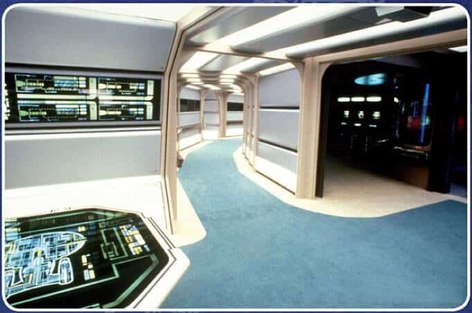
A giant starship…the size of a 2-car garage
The trick, the art director told me, was to create structures that were familiar enough to viewers that their brains filled in the rest. Optical illusions: a staircase that leads off screen may not actually go anywhere, but if it goes beyond the frame, then it must go somewhere, right?
IF YOUR DESIGN HAS NO END, IT MUST BE ENDLESS
The same theory applies to borderless designs.
Just as the box-shaped prints of the old heat-transfer sheets indicated that the printed space was all that was there, the lack of visible borders implies the opposite.
Without a border or frame, your design is not a prisoner of the garment, but a part of it.
A blank t-shirt is just a t-shirt. But if you put, say, the Nike logo – even just the simple swoosh – on it, it is a branded garment. In fact, the garment becomes secondary to the design, whereas a boxy bordered print is clearly an addition to the shirt, a second thought, an application.
Using a simple logo on a t-shirt makes it a fashion item, a uniform, a statement. It transforms the garment itself by indicating its use. It is an adornment, a worker’s tool, a company mission.
This also applies to simple text.
In the 1970s, one of the most popular novelty shirts was a simple cartoon image of a hand pointing left (or right) with the text “I’m With Stupid” printed beneath. It automatically transformed the person standing on the side of the pointed finger into the butt of the joke just by standing on the wrong side of the wearer.

This wasn’t just something to wear, it became a practical joke. Like a joy buzzer or wind-up chattering teeth.
Fifty years later, the tables have turned.
Using simple text on a t-shirt puts the focus on the message, and not the medium. It serves the same purpose as a button, a bumper sticker, a flag. There is no need to contain it in a frame unless the frame itself is a critical design element of the message itself.
The color of the garment itself can also be an active element that enhances your graphic, instead of just a printed substrate.
In an earlier blog we talked about color, and how the use of complementary/contrasting colors on the color wheel can be applied to t-shirt design. A simple graphic, logo or phrase makes all the difference if its color scheme interacts with the color choice of the shirt.
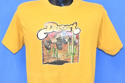
Especially in this case (IYKYK): PS, don’t do this on Amazon
![]()
This guy is not gonna make it back from the landing party.
Lastly, I promise this is the last “Star Trek” allegory: the “implied continuity” esthetic. This is an approach to a design that explicitly omits part of a graphic, but the brain fills in the missing part.
For example, a mountain and a setting sun with no sky, or a surfer on a wave with no ocean, a jeep kicking up dirt and rocks but no road – the viewer has already seen these images elsewhere and doesn’t need the graphic to be present.
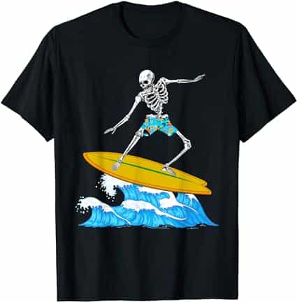
When you’re designing, there is a tendency to want to show as many of the elements of your image as can fit in the print area, but omitting part of it has several advantages. It prevents the design from looking like it is only constrained to the print area – and therefore avoiding an unprofessional “printed at the mall” appearance. It allows the shirt itself to replace that omitted image, and well beyond the borders of the print area – a blue shirt becomes the ocean, a brown shirt becomes a dirt road, a deep purple or black shirt becomes the vastness of space.
So, by staying within but not using the entire print area, you are in effect thinking outside the box while still staying safely within it.
How did you creatively overcome the constraints of Amazon’s Merch-On-Demand print limitations? Let us know in the comments below.