Spooky Season 2025: Halloween Phone Case & PopSocket Designs That Convert
Why phone accessories crush during Spooky Season
Few Halloween products deliver the same mix of impulse appeal, daily visibility, and giftability as phone accessories. Cases and PopSockets sit at a low price point, are easy to justify as a seasonal treat, and they’re seen dozens of times a day—on the subway, at a party, in selfies, at a desk. That frequency compounds: a design that gets noticed quickly becomes a conversation starter, which in turn nudges organic discovery and social sharing.
Seasonality helps, too. Searches begin rising in late August, crest through October, and—if you plan your listings well—roll into November as shoppers pivot from Halloween-specific keywords to evergreen “witchy” and “goth” aesthetics. Add the fact that phone accessories are light, easy to ship, and often bought in multiples (“one for me, one for my friend”), and you’ve got an ideal canvas for fast-moving Merch launches.
Your edge this year? Merch Informer’s volume and competition data. Used properly, it lets you avoid saturated trends and instead target winnable micro-niches with designs engineered for tiny canvases.
Audience segments & intent (so your designs feel made-for-them)
Not all spooky buyers are the same. Map your design language to these segments:
- Horror superfans — Bold graphics, classic tropes (haunted houses, graveyards, masked silhouettes), and references to VHS-era chills (without using specific IP).
- Aesthetic shoppers — Witchy/cottagecore, pastel goth, celestial themes, botanical elements; subtle, room-friendly color stories.
- Humor/pun buyers — Cute-spooky, office-safe jokes; cartoon ghosts, candy corn, skeletons doing ordinary things.
- Minimalist dark vibes — Monochrome iconography, clean typography, tiny occult hints; great for adults who want low-key spooky.
For each segment, decide: loud vs. subtle, type-forward vs. icon-first, and classic vs. pastel/neon palettes. Your SEO and imagery should mirror that decision.
Data first: validate with Merch Informer
Don’t start in Illustrator—start in Merch Informer.
- Product Search
Query combinations like:
- “halloween phone case,” “spooky phone case,” “witchy phone case,” “goth phone case”
- “halloween popsocket,” “spooky popsocket,” “ghost phone grip,” “witchy popsocket”
Sort by sales proxies to see what’s actually moving. Note recurring motifs (planchettes, moons, retro slasher silhouettes, cryptids) and spot gaps—e.g., lots of witch hats, few Mothman silhouettes; many orange/black schemes, few pastel goth variants.
- Keyword Finder
Generate 30–50 long-tails. Examples to seed your list:
- “pumpkin phone case cute,” “pastel goth phone case,” “witchy planchette case,” “cryptid phone case,” “vhs horror phone case,” “minimal skull phone case,” “cute ghost popsocket,” “tarot moon popsocket.”
Tag each by audience segment so your titles/bullets stay consistent.
- Competition Checker
Prioritize high/medium volume + low/medium competition. If “witchy phone case” is red-hot but saturated, try a derivative with a style modifier: “witchy cottagecore phone case,” “witchy moon botanical case.” - Trend Hunter
Confirm rising aesthetics (e.g., neon slime green highlights, purple/orange duos, blackletter revivals, vaporwave gradients). This protects you from designing to last year’s palette.
Deliverable from research: 3–5 micro-niches to attack first, each with its own palette + typographic direction.
Safe parody: pop culture without IP landmines
Parody can be a powerful hook during Halloween—but only if it’s original and non-infringing. Stay in the safety lane by designing around archetypes and tropes, not characters or titles.
Do design with:
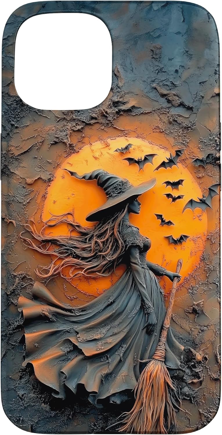
- Tropes: haunted houses, jack-o’-lanterns, ghost sheets, cemetery gates, witches’ hats and cauldrons, planchettes/tarot symbolism, UFO beams, general cryptids (silhouettes, footprints).
- Transformative humor: original puns that don’t reference specific franchises (e.g., “Creep It Cozy,” “Mostly Here For Candy,” “Book Ghoul”—with a stack of books).
- VHS-era vibes: rewind stickers, tape texture, tracking glitches—no movie names, quotes, or iconic masks.
- Retro slasher moods: spotlight beams, woodgrain doors, knife-shaped negative space—avoid distinct costumes or color blocking tied to any known property.
Avoid:
- Character names, logos, quotes, distinctive costumes or color arrangements (“trade dress”) associated with a particular franchise.
- Locations uniquely tied to a property.
- Fonts and layouts meant to mimic famous title treatments.
Quick compliance checklist before upload
- No names/quotes/logos from known IP.
- No lookalike color blocking or distinctive outfit silhouettes.
- Original wording for jokes; no song/film quotes.
- Font is licensed for commercial use (keep a license folder).
Horror typography that reads on tiny canvases
Text that slays on a T-shirt can die on a phone case or PopSocket. Scale and contrast are everything.
Type families that work well
- Blackletter/Fraktur — Immediate horror vibe. Pair with a clean sans for subcopy to improve readability.
- Condensed gothics — Strong presence in tight spaces; great for PopSocket circles.
- Eroded/grunge — Use sparingly; keep counters (the holes in letters) open so they don’t fill in at small sizes.
- Rounded block sans — Perfect for cute-spooky humor and pastel goth; thick strokes read well when shrunk.
Rules of readability
- One hero word (e.g., “SPOOKY,” “WITCHY,” “CREEP”) at large size; short secondary line below.
- Stroke/outline or drop shadow when placing text on busy textures; use subtle offsets to increase contrast without muddying.
- Mind the circle for PopSockets: avoid long phrases; use a single word or icon + micro-label.
- Letterspacing: tighten slightly for headlines; loosen micro-copy so it doesn’t blur.
Licensing reminder
Always verify your font license for commercial use and archive a copy of the license with your design files.
Color palettes that convert on cases & PopSockets
Good palettes do three things: pop in thumbnails, print cleanly on substrates, and align with the buyer’s aesthetic.
Classic Halloween
- Orange/Black, Purple/Green, Red/Charcoal, Bone/Ink.
- Tip: Pair bright orange with muted charcoal (not jet black) to reduce eye strain while retaining contrast.
Pastel Goth (cute-spooky)
- Lavender, Mint, Baby Pink + Black accents.
- Tip: Use black for outlines/eyes; let pastels fill shapes for a plush, toy-like vibe.
Witchy Cottagecore
- Rust, Moss, Cream, Midnight Blue.
- Tip: Lean on cream for text and botanical linework; it feels warm and decor-friendly.
Neon Slasher / Vaporwave
- Magenta, Cyan, Electric Purple + Deep Navy or Charcoal.
- Tip: Let neon be the accent; ground it with a dark field so it doesn’t wash out.
Noir Minimal
- Charcoal, Off-White, Subtle Metallic Simulations.
- Tip: Use a single icon (planchette/phase-of-moon) and keep contrast high for adult buyers.
Micro-guidelines
- Test both light and dark device mockups; some tints vanish on space-grey phones.
- Keep PopSocket designs to 2–4 hues; small circles get busy quickly.
- Reserve gradients for backgrounds or simple shapes; avoid gradient-filled small text.
Canvas constraints: designing for small surfaces
Phone cases
- Respect the camera cutout and any side wraps. Keep core messaging within the safe area.
- Edge ornaments (bats, stars, drips) can wrap without harming legibility.
- Use vertical composition; most users view cases portrait orientation.
PopSockets
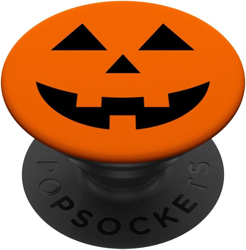
- Design to a circle from the start; center the focal element.
- Avoid long text arcs; short words or initials feel intentional.
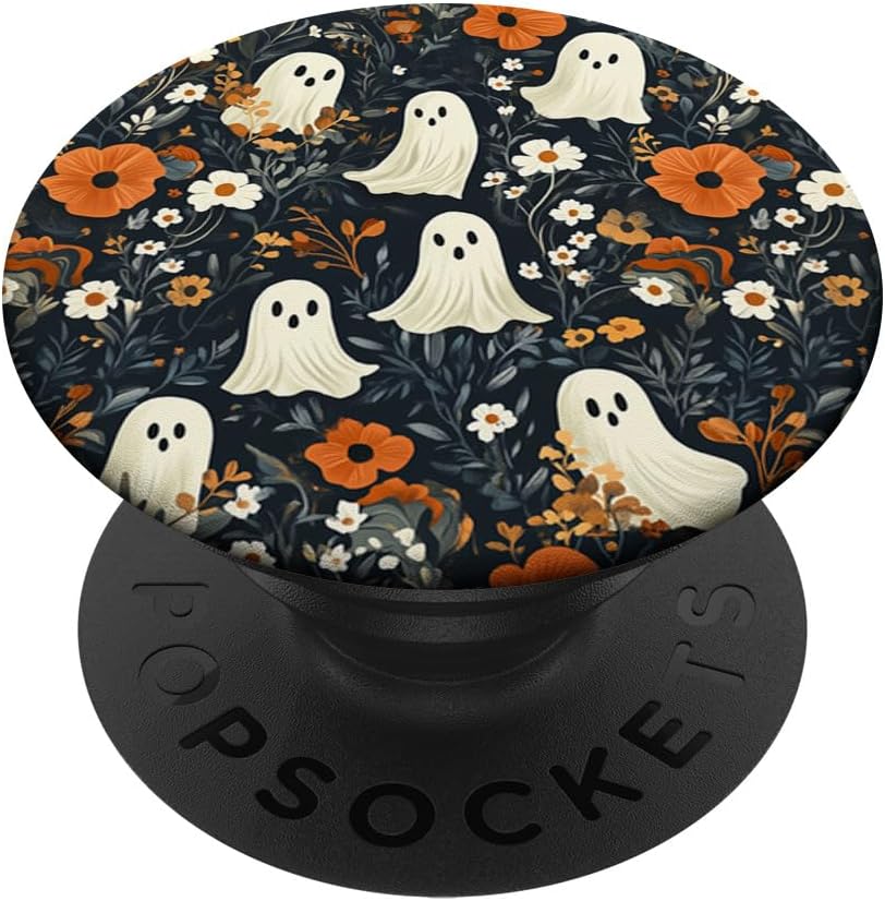
- Choose a bold icon (planchette, ghost, moon phase) and a single supporting line if needed.
General
- Increase stroke weight relative to print-on-fabric designs.
- Use larger iconography than feels “normal”—it will look right at arm’s length.
- Always export at 300 DPI; preview at 25–50% zoom to simulate how tiny details will render.
Build with speed: a data-driven 30-minute design brief
High output wins the season. Here’s a repeatable sprint powered by Merch Informer:
- 10 minutes — Research
- Product Search + Competition Checker: pick one or two long-tails with winnable competition (e.g., “witchy planchette phone case,” “pastel goth ghost popsocket”).
- Note best-selling palettes and typographic styles from adjacent listings.
- 5 minutes — Palette + font pairing
- For “witchy cottagecore”: Midnight Blue + Cream + Moss; Blackletter headline + sans subcopy.
- For “pastel goth”: Lavender + Black + Mint; rounded block sans headline.
- 10 minutes — Compose in Merch Designer
- Build the phone case first. Balance icon + word.
- Adapt to PopSocket: extract the icon; shorten the text to 1–2 words; center-lock it.
- 5 minutes — Compliance + export
- Trademark scan your phrase; confirm font licensing; export 300 DPI; file with a standard naming scheme.
Result: One case + one PopSocket design aligned to validated demand—shipped in half an hour.
Listing SEO & creatives that actually rank
Title starters (adapt to your verified long-tails):
- Witchy Planchette Phone Case – Midnight Blue & Cream – Spooky Aesthetic 2025
- Pastel Goth Ghost PopSocket – Cute Spooky Phone Grip – Halloween 2025
- Minimal Skull Phone Case – Black & Bone – Subtle Horror Aesthetic
Bullets that sell
- Audience/style: “Witchy cottagecore palette with botanical accents” / “Cute-spooky pastel goth.”
- Design specifics: “High-contrast headline, bold icon sized for small surfaces.”
- Occasion timing: “Perfect for costume parties, office-friendly spooky season, and October selfies.”
- Set nudge: “Pairs with matching PopSocket/phone case—see our brand collection.”
- Quality reassurance: “Designed with small-canvas readability in mind; clean lines at 300 DPI.”
Images
- Primary: straight-on, crisp, no busy background.
- Alt images: in-hand lifestyle, dark and light phone variants, close-up showing line weight.
- Keep text readable at mobile thumbnail size—if you can’t read it on your phone, neither can shoppers.
Pricing, bundles, and boosting AOV
PopSockets
- Common range: $14.99–$19.99. Unique palettes and iconography justify upper tier.
Phone cases
- Common range: $16.99–$21.99. Minimalist luxury or neon slasher effects can support the higher end.
Bundle strategy (without bundling)
- Cross-link matching sets (case + PopSocket) in bullets and within your Brand Store.
- Time-box a coupon Oct 15–25 to catch costume-party shoppers.
- In back matter of your Brand Store, showcase “You might also like” tiles for the matching item.
Timeline to win Halloween 2025
- July — Publish 10–20 base designs across 3 aesthetics (witchy, pastel goth, minimal noir). Index early.
- August — Use Merch Informer to identify 3–4 promising micro-niches (e.g., cryptids, VHS glitch, planchette monograms). Launch variations.
- September — Scale winners: new colorways, alternate font pairings, case/PopSocket set for each top SKU.
- Oct 1–20 — Raise bids on converting long-tails; drop last-minute humor/cute variants for party buyers.
- Oct 21–31 — Messaging around “party-night add-on,” “gift for the ghoulfriend,” “selfie-ready grip.”
- November — Pivot keywords and bullets to evergreen goth/witchy and “fall/winter dark aesthetic.”
Creative playbook: ready-to-use prompts
Witchy cottagecore (case)
- Headline: “Moonlit Rituals” (Blackletter)
- Subcopy: “Midnight—Moss—Cream” (small sans)
- Icon: Planchette with crescent + vines (centered)
Pastel goth (PopSocket)
- Icon: Blobby ghost with star cheeks
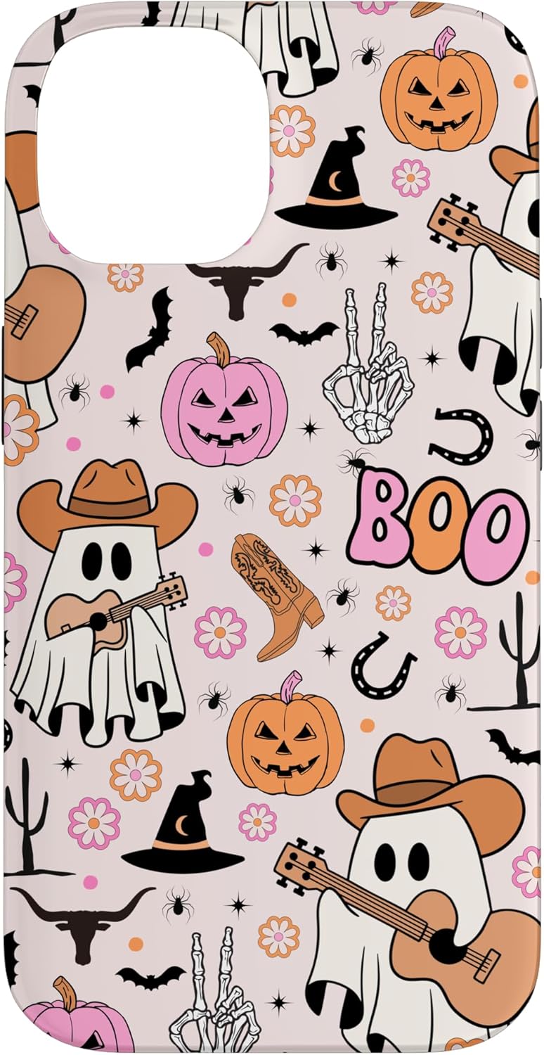
- Word: “BOO” in rounded block sans
- Palette: Lavender/Mint/Black
Minimal noir (case)
- Icon: Single skull line art (bone on charcoal)
- Word: “Quiet Horror” (condensed gothic)
- Subtle frame line near edges
VHS slasher (case)
- Word: “REWIND” (condensed sans with glitch slices)
- Subcopy: “Be Kind” (tiny label)
- Accents: Cyan/Magenta scan lines on deep navy
Cryptid silhouette (PopSocket)
- Icon: Mothman wings, tiny red dots for eyes
- Word: “SIGHTED” (all caps, tight tracking)
Use these as starting points; swap palettes and fonts to multiply your SKU count without reinventing from scratch.
Quality & compliance guardrails
- Zero IP tolerance: no titles, quotes, logos, or distinctive costumes. Tropes only.
- Trade dress awareness: don’t emulate famous poster/type treatments.
- Font licensing: store proof of commercial rights.
- Print checks: 300 DPI exports; heavier strokes; contrast tested on light/dark phone renders.
- Accessibility: avoid red/green reliance; ensure text-to-background contrast is strong.
Your 60-minute daily shipping routine
- 10 min — Merch Informer scan: Product Search + Competition Checker → pick 1 niche + 1 long-tail.
- 10 min — Palette + type: decide aesthetic; grab pre-approved fonts.
- 25 min — Design: case first, then PopSocket adaptation.
- 5 min — Compliance: trademarks/fonts; export assets.
- 10 min — Listing: title (with long-tail), bullets (audience + palette + set), upload images, cross-link set.
Repeat 5 days a week from July through September and you’ll have a robust catalog live before peak traffic.
Action checklist (copy/paste)
- Validate 3–5 micro-niches in Merch Informer (volume + competition).
- Define palettes + font pairs for witchy, pastel goth, and minimal noir.
- Design paired sets (case + PopSocket) with safe-area templates.
- Write long-tail titles and audience-specific bullets; cross-link the set.
- Price mid-market; schedule Oct 15–25 coupons.
- Monitor rankings; double down on winners; pivot to evergreen goth/witchy in November.
Final word
Halloween phone accessories reward speed, specificity, and restraint: speed to hit the indexing window; specificity to speak to a particular spooky tribe; restraint so tiny canvases stay readable and chic. When you let Merch Informer’s volume + competition data steer your topics—and you design with small surfaces in mind—you’ll ship a catalog that captures the rush from late August through October and still sells as evergreen dark aesthetic the rest of the fall.
Pick your micro-niches, lock your palettes, and launch your sets. The scariest thing this season would be leaving that demand on the table.