Mockup Truth: What to Show So Buyers Trust You (Without Overpromising)
Mockups are the strangest part of POD.
They aren’t the product… but they’re the only product the buyer can touch before money leaves their account. And because POD is already a leap of faith (“I can’t hold it, I can’t feel it, I’m trusting a stranger and a printing pipeline”), mockups don’t just sell the item. They sell certainty.
That’s why “pretty” mockups can actually hurt you if they feel too perfect.
Buyers rarely say, “This mockup seems unrealistic, therefore I will not purchase.” They do something quieter: they hesitate. They open a new tab. They keep scrolling. They tell themselves they’ll come back later… and they don’t.
Mockup truth is simply this: make your product look good, but make it look believable—so the buyer’s brain can relax and say:

“Yep. That’s what I’m going to get.”
Not “probably.” Not “maybe.” Not “I hope so.”
The real enemy isn’t bad mockups. It’s doubt.
If you want to understand the trust gap, picture someone buying a gift. They’re already anxious. They’re trying to avoid the feeling of giving something that looks cheap or arrives wrong. They’re looking for reassurance everywhere—your photos, your description, your shop consistency, your reviews.
In that headspace, mockups do one of two things:
- They reduce uncertainty → “This is safe. I can buy this.”
- They create uncertainty → “This looks amazing, but is it real?”
And POD is full of uncertainty traps: color shifts, slight placement variation, fabric texture differences, print finishes that look different in different lighting. Your job isn’t to pretend those realities don’t exist. Your job is to make the product look like the product.
What mockup truth looks like in practice
A trustworthy listing usually feels like it’s saying: I’m not trying to trick you. I’m trying to help you choose confidently.
You get there by building a simple “proof stack” across your images. You don’t need a million mockups. You need a handful that each answer a specific buyer question.

Here’s the stack:
- Show me what it is. (clearly, instantly, at thumbnail size)
- Show me how it looks in real life. (context, lifestyle, use)
- Show me the important details. (close-up where it matters)
- Show me the scale. (worn/held/placed in a normal setting)
- Show me what can change. (colorways, options, print area)
If your listing hits those beats, buyers stop imagining worst-case scenarios.
The “too perfect” problem
There’s a certain kind of mockup that screams “marketing render.” Super glossy. Hyper-clean lighting. The design sits on fabric like it was painted by a laser. The shirt has no wrinkles, no seams, no texture. The mug looks like a 3D product shot from a Fortune 500 ad.
Those mockups might look impressive… but they can also trip a buyer’s internal scam alarm.
Because real products live in real lighting, with real fabric, and real imperfections. When everything looks too idealized, buyers think:
- “Will the print actually be that crisp?”
- “Will the colors actually be that bright?”
- “Is this one of those shops where the mockup is better than reality?”
Again, they won’t always complain. They’ll just leave.

A few small choices that build trust fast
You don’t have to overhaul your entire process. A couple of “truth signals” can do a lot of work:
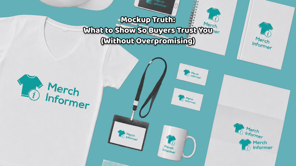
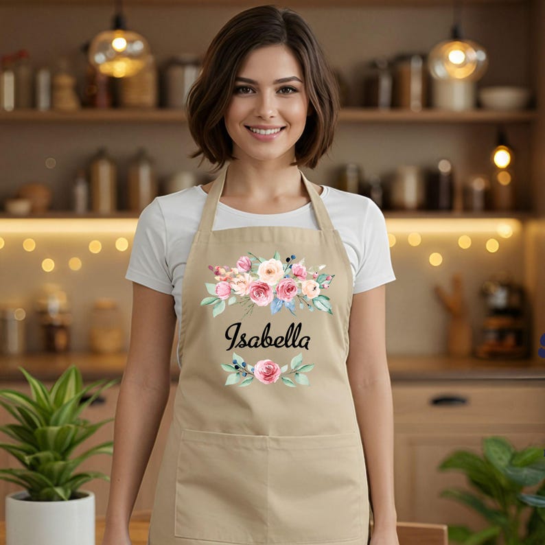
- Mix one clean mockup with one real-life mockup.
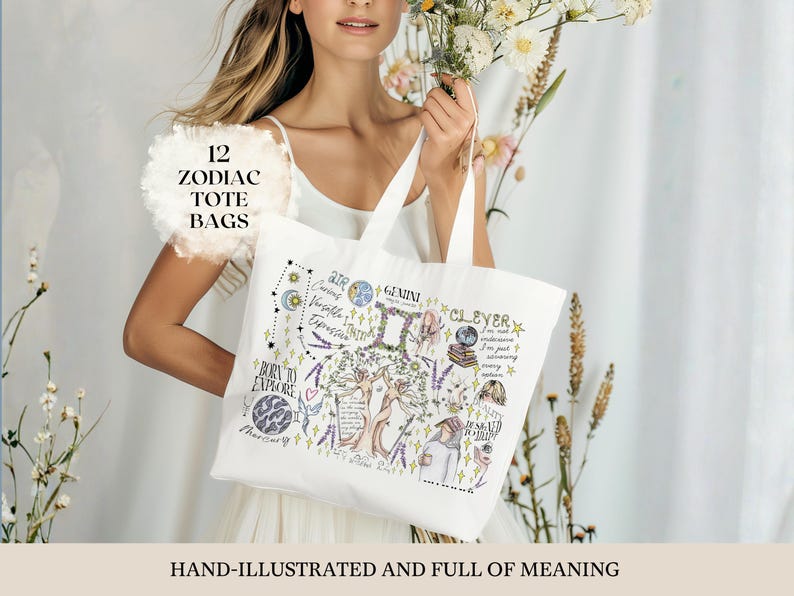
The clean image sells readability; the lifestyle image sells believability. - Use at least one close-up when detail matters.
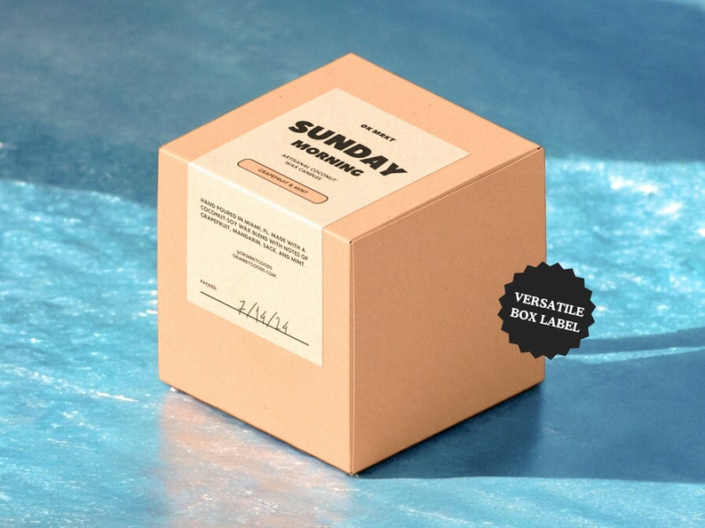
If your design includes fine lines, small text, or texture, show it up close. - Prove the print area.
If buyers don’t know what’s printed (front only? sleeve? back?), they hesitate. - Show scale.
A tote on a plain background is fine; a tote on a shoulder makes it real. - Add one calm “reality sentence” in the listing copy.
Something like: “Colors may vary slightly from screen to print.”
That doesn’t scare buyers—it reassures them that you’re professional.
Here’s the key: none of this is about making your product look worse. It’s about making it look true.
The biggest conversion win: mockups that match each other
Consistency across your shop is its own form of trust.
When every listing uses a different mockup style—some bright white studio, some moody lifestyle, some wild collage—the shop starts to feel random. And random equals risk.
A cohesive mockup style (even a simple one) makes your shop feel like a brand. Brands feel safe.
If you want one simple rule:
Pick a mockup “language” and stick to it.
Final thought
Mockups aren’t about perfection. They’re about confidence.
If your images reduce uncertainty—clear design, believable context, visible details, honest scale—buyers feel safe. And when buyers feel safe, they buy.
That’s mockup truth.