Complementary PopSockets + Phone Cases – Design Rules, Color Logic, Graphic Types, and Clever Ideas for Merch by Amazon Creators
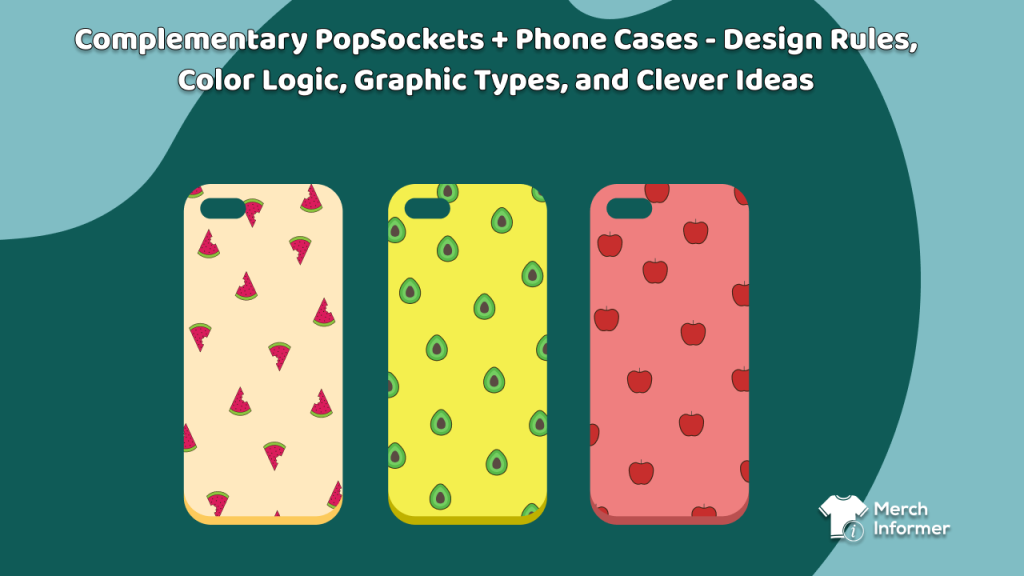
Most creators treat PopSockets® and phone cases as two separate SKUs—and that’s fine. But coordinated designs are an under-served niche on Merch on Demand. When a shopper sees a matching or intentionally contrasting case + grip, the pair registers as one polished look even though each item sells separately.
That’s your opportunity: coordinated designs that feel like a set, look premium in thumbnails, and let you build repeatable “style collections” through the year. This is your field guide—how to stay within Merch by Amazon’s product parameters while producing combinations that look deliberate, balanced, and brand-ready.
1 | Why Pairing Works
- Completeness sells. A visually unified duo feels like a set. Shoppers imagine the final look on their phone, not a lone accessory.
- Low competition. Few sellers consider inter-product design. Less noise = easier discovery.
- Collection power. “Series” language (Retro Grid, Quiet Campus, Floral Noir) invites seasonal drops and repeat buyers.
Your goal: design a pair that reads as one visual statement. The case provides the field; the PopGrip acts as the focal badge.
2 | Canvas Realities on Merch by Amazon
- PopGrip: small circular print area—details and long text vanish. Keep graphics bold, shapes simple, and contrast high.
- Phone case: full-bleed rectangle with camera/sensor cut-outs. Keep key elements 0.25 in / 6 mm from edges.
- Legibility test: view at 100 % and arm’s length. If it’s unreadable, simplify.
- Color consistency: both items print separately; use the same RGB palette and export together.
- No special finishes: all color and texture must come from flat artwork—no metallics, embossing, or gloss effects.
Pro move: Build a single master artboard with both templates side-by-side so you compose the relationship together.
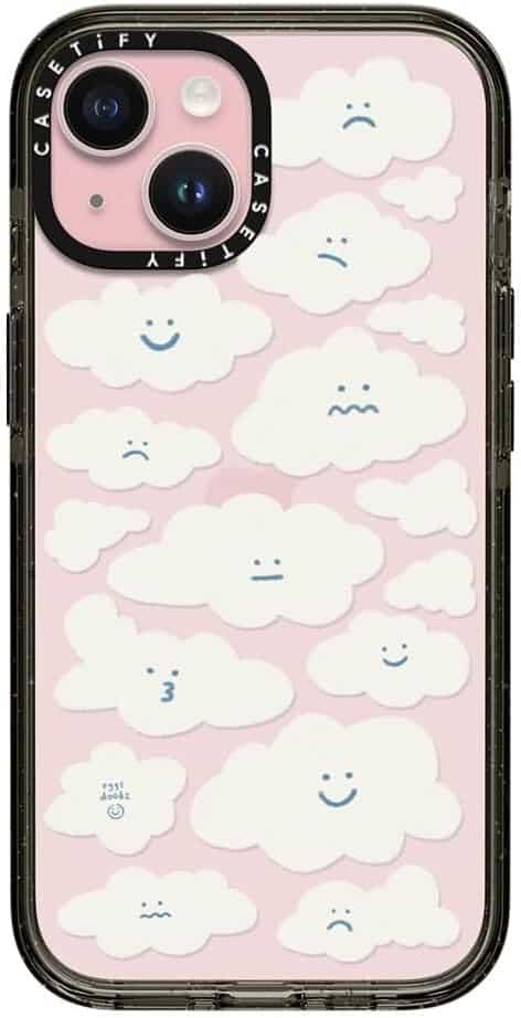
3 | Match vs Complement
Matching = the PopGrip looks like a cropped section of the case—same pattern and palette.
Complementary = the PopGrip contrasts deliberately—different, but harmonized.
Use matching for minimalist or pattern-driven collections.
Use complementary for illustrated or typographic sets.
Rule: one hero (focus) + one support (background). Never compete for attention on both.
4 | Color Systems That Work in RGB Print
- Monochrome + Accent – Case: gradient or texture in one hue ; PopGrip: same hue with a bright accent line.
- Analogous Harmony – Adjacent hues (teal–blue–indigo) ; calm and natural.
- Complementary Pop – Opposites (coral / teal) moderated with white or black.
- Split Complement – One main hue + two near-opposites for sophisticated balance.
- Neutral + Signature – Gray/charcoal base + one branded color (purple, orange).
Tip: On the PopGrip, prioritize value contrast (light vs dark) over subtle color shifts—small surface, instant read.
5 | Graphic Types That Print Cleanly
Phone Case = Background Field
- Repeating tiles, stripes, terrazzo, or simple gradients.
- Large silhouettes or soft photo textures (marble, carbon fiber, paper grain).
- Bold abstract shapes—not micro-detail.
PopGrip = Badge or Emblem
- Icons, monograms, or short words (≤ 8 letters).
- Thick lines (≥ 2 px at final size).
- Strong geometry—circles, shields, or simple sigils.
6 | Composition Playbook
- Badge + Field – Patterned case + central badge on the grip.
- Zoom & Crop – Case shows macro texture ; grip shows the miniature reveal.
- Inside / Outside – Case = environment ; grip = key object.
- Color Inversion – Light case + dark grip, same motif.
- Directional Alignment – Lines on case lead toward the typical PopGrip position.
- Grid vs Organic – Case = rigid pattern ; grip = hand-drawn break.
- Ring-Aware Design – Treat PopGrip edge as a frame; avoid hairline borders.
7 | Ideas That Stick in Memory
- Illusion pairs: case = camera body ; grip = lens.
- Collectible badges: case = map texture ; grip = park crest or constellation icon.
- Two-part jokes: case = “Don’t Push” ; grip = big red button.
- Monogram sets: case = pattern ; grip = ornate initial.
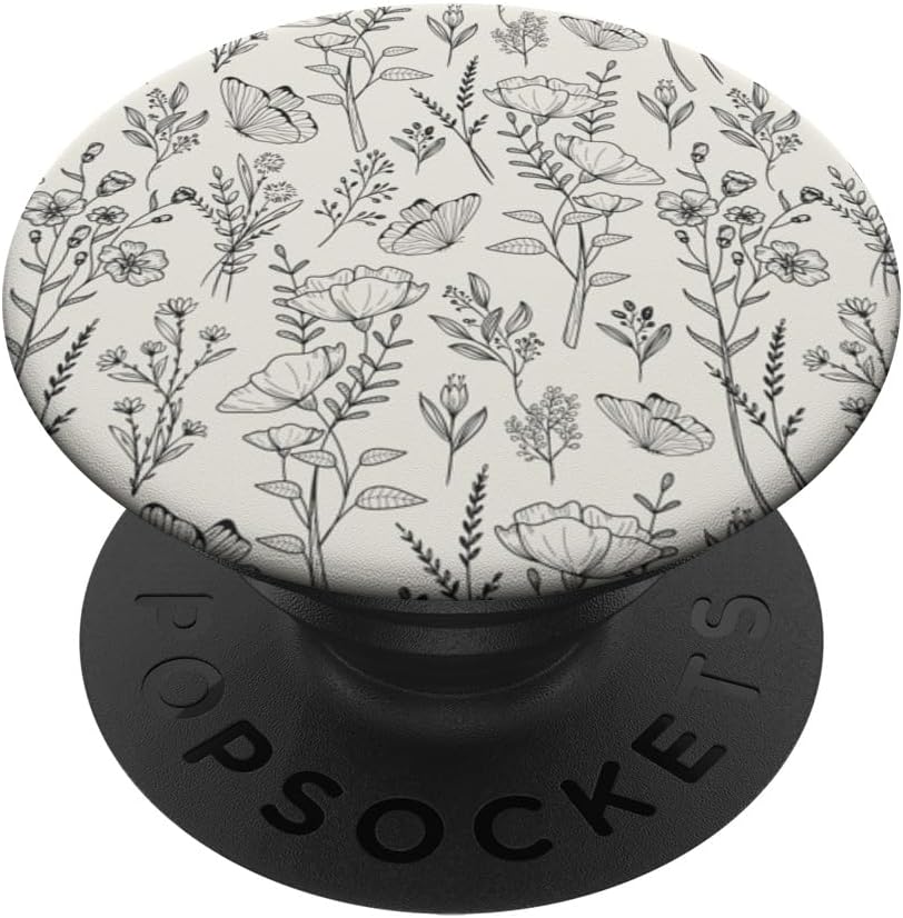
- Seasonal capsules: spring florals + bloom crest ; summer surf + board-wax stamp ; winter knit + snowflake seal.
- Fandom-adjacent themes: retro kaiju, space explorer, dungeon crawler—original art only, never infringing IP.
8 | A Simple Design System
- Palette (5–7 swatches: 2 dark, 2 light, 2 accents, 1 wild card).
- Type (1 display + 1 neutral sans).
- Pattern engine (stripes, dots, terrazzo, grids).
- Badge frame (circle, hex, shield).
- Matrix (6 case fields × 6 badge variants = 36 potential SKUs).
Consistent branding, minimal new concepting.
9 | Production Reality Check
- Use Amazon templates for both items.
- Design at actual size, 300 DPI, and preview at 100 %.
- Keep essential details off case edges and camera zones.
- Export transparent PNGs (sRGB).
- File names: theme-color-variant_product.png (e.g., botanical_noir-fern-gold_case.png).
- Mock them side-by-side for your own QA; never imply bundling in listings.
10 | Merch Informer: Quick, Smart Validation
- Keyword discovery: surface phrases like “matching phone grip,” “coordinating PopGrip,” “aesthetic case + grip.”
- Trend check: test interest lines for aesthetics (“quiet luxury,” “checkerboard,” “kawaii”) before designing.
- Competition scan: look for weak listings in pairing niches.
- Copy cues: study adjectives that convert—“sage green,” “charcoal,” “pastel.”
In your bullet points, describe naturally:
“Designed to coordinate with our [Theme] PopGrip.”
Avoid bundle language—each item lists separately.
11 | 10 Palette-Based Pair Concepts
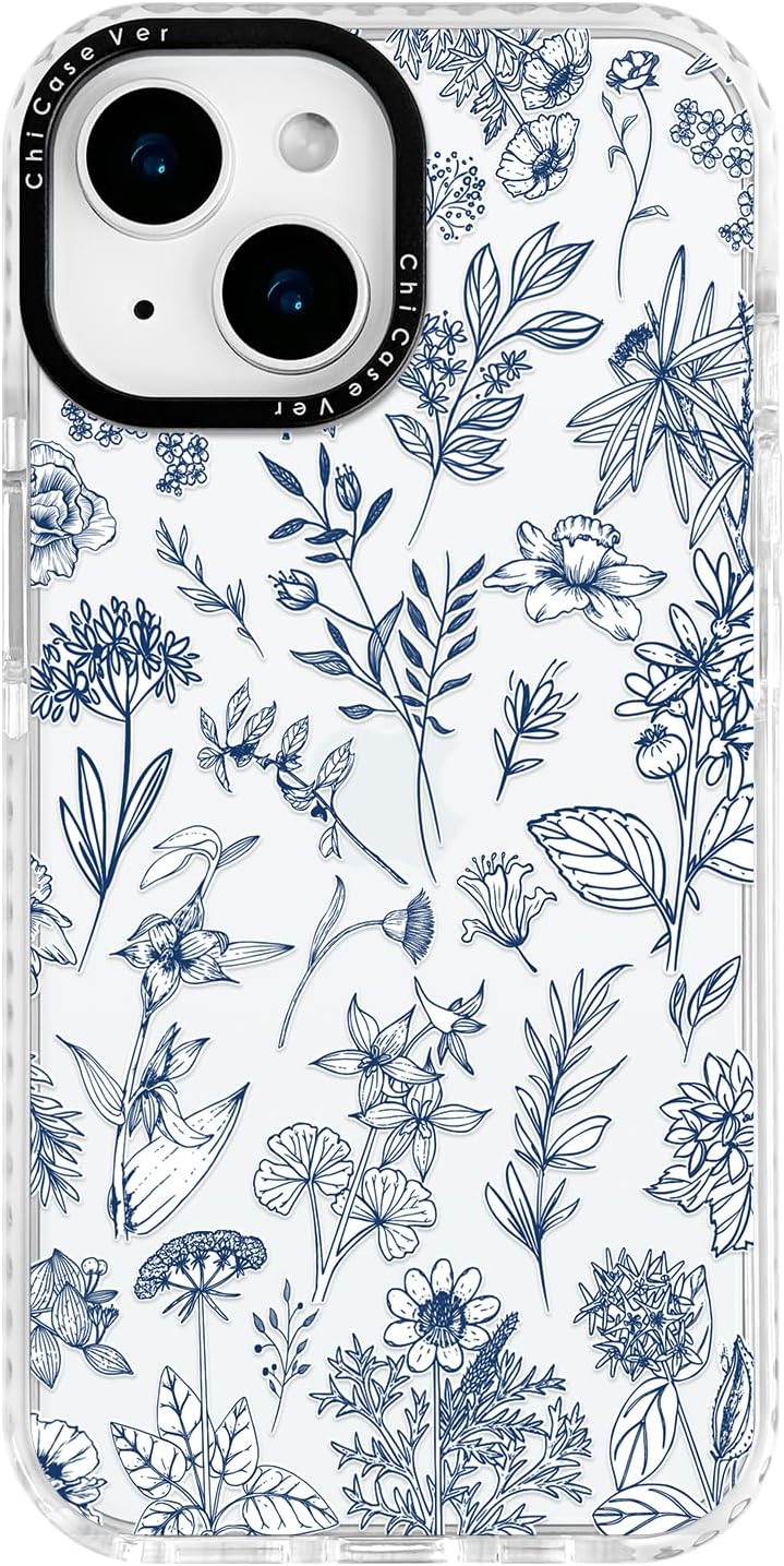
- Botanical Noir – charcoal leaves + gold-line crest.
- Vapor Arcade – neon grid + pixel coin.
- Quiet Campus – herringbone pattern + collegiate monogram.
- Cosmic Survey – star-map lines + mission patch.
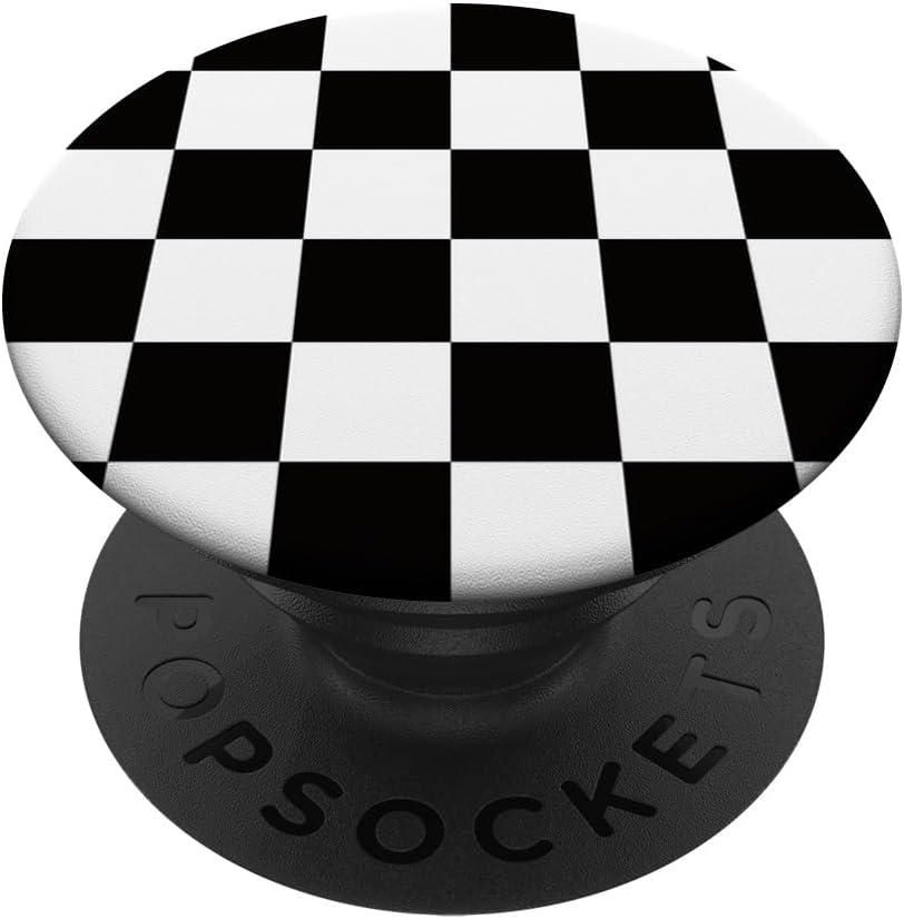
- Checker Pop – black-white checks + single-word badge “PLAY.”
- Desert Terrazzo – clay chips + cactus icon.
- Audio Lab – equalizer bars + dial emblem.
- Kawaii Picnic – gingham hearts + strawberry icon.
- Street Tech – hazard stripes + chevron number.
- Ocean Engine – layered waves + compass crest.
12 | Common Pitfalls → Fixes
| Problem | Quick Fix |
|---|---|
| PopGrip too detailed | Simplify to 1 icon + bold stroke |
| Case & Grip both busy | Choose a hero; desaturate the support |
| Palette mismatch | Test swatches on both templates |
| Edge collisions | Keep “safe zone” mask active |
| Delicate type | Use heavier fonts; tighten tracking |