Stained Glass (Prism) Aesthetic: What It Is, Why It Charms, and Where It Belongs
A very short history
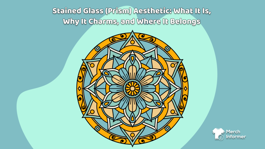
Stained glass began as storytelling in light—colored panes separated by dark “leading,” arranged as rosettes, arches, and patterned windows. Over centuries, it moved from cathedrals to townhouses, train stations, Art Deco theaters, and mid-century door panels. The constant: bold compartments of color that read from far away and feel a little magical when light meets geometry.
What it feels like
- Luminous calm: rich color without chaos; the dark “lead” lines keep everything grounded.
- Craft energy: it hints at handwork and tradition even when the art is digital.
- Order + emotion: geometry gives structure, color brings mood.
Where you see it (past and present)
- Heritage: church windows, Victorian door transoms, Deco foyers, transit halls.
- Design & decor: mosaic lamps, geometric room dividers, bold color-block murals.
- Fashion & graphics: rosette crests on tees, tiled repeats on textiles, jewel-tone posters.
Why it works on Merch on Demand
- Reads at a glance. Big shapes + clear outlines = strong thumbnails and good shelf impact.
- Scales into collections. One palette can power a tee crest, a pillow repeat, and a few seasonal colorways.
- Timeless but current. It nods to history while fitting right in with today’s color-forward interiors.
(Reality check for Merch: flat RGB prints only—no foil, no glassy materials. Think “the look of stained glass,” not the literal shine.)
Where it sings (and how to lean in)
T-shirts (hero artwork)
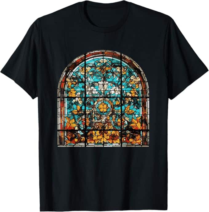
- Best formats: a single medallion/rosette, vertical “window” panel, or clean arch around a simple motif (sunburst, fern, wave).
- Best palettes: jewel tones on dark shirts; coastal/opal tones on light shirts.
- Typography: minimal or none—let the geometry speak.
Pillows (pattern canvas)
- Best formats: full-bleed repeats—hex tessellations, chevron cascades, small rosette tiles.
- Front/back contrast: bold mosaic front; quieter, textural back for easy styling.
- Living-room distance: keep panes large enough to read from across the room.
Themes that travel well
- Cathedral Deco: fan rays, arches, oxblood + ink + brass-olive.
- Coastal Prism: sea-glass greens, lagoon blues, sand neutrals.
- Night Garden: near-black field, moss/teal panes with botanical tracery.
- Opal Dream: pearl, blush, lilac, aqua—soft, airy, serene.

Where it stumbles (and how to avoid it)
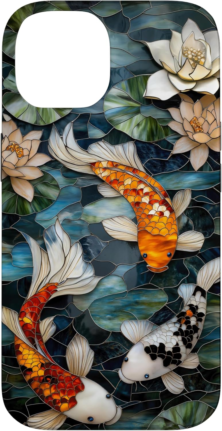
- Sticker look. If everything has a hard edge on a flat background, it can feel pasted on. Fix: add soft value shifts inside panes; let a few edges “breathe” into the field.
- Rainbow soup. Too many colors with no anchor. Fix: pick 2–3 hero hues and one dark “lead” color to hold the design together.
- Fussy micro-tiles. Tiny panes turn mushy at print size. Fix: fewer, larger facets.
- Literal church window clones. Feels costume-y. Fix: borrow the logic (panes + leading), not the iconography.
- Appropriation pitfalls. If nodding to island or sacred motifs, keep it abstract and geometric, or collaborate and credit.
Motifs that feel right (and stay universal)
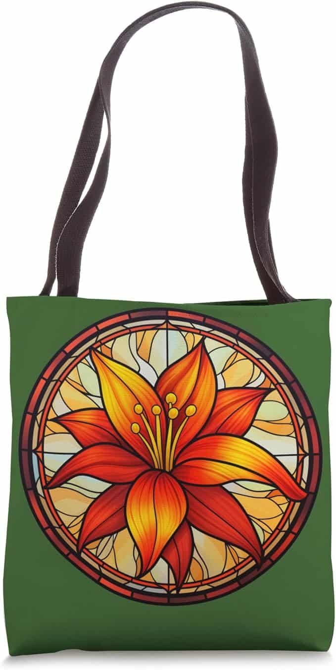
- Rosettes & wheels: concentric rings with alternating facets.
- Arches & frames: pointed or rounded windows for a single bloom or sun.
- Botanical panes: leaves and ferns broken into jewel facets—nature via geometry.
- Tessellations: hex/triangle grids that tile into calm, rhythmic surfaces.
- Ribbons: interlaced bands (kept purely geometric) for a subtle “crafted” cue.
Light-touch color guidance
- Jewel Cathedral: emerald, sapphire, ruby, amethyst + near-black leading → dramatic, classic.
- Coastal: sea-glass green, teal, lagoon, bone → breezy, fresh.
- Deco Sunrise: burnt orange, oxblood, brass-olive, ink → warm, cinematic.
- Opalescent: pearl, blush, lilac, aqua → dreamy, airy (better on light bases).
- Night Garden: ultramarine, moss, teal on charcoal → quiet glow.
(Keep one deep anchor, one light field, and a few mids. That balance is the “stained glass” feeling.)
Quick do/don’t (creator-friendly)
Do
- Lead with big shapes and clear compartments.
- Think collection: one crest tee + one repeat pillow + one alternate palette.
- Keep language universal; let geometry carry the vibe.
Don’t

- Promise shine/metallics—prints are flat.
- Overcrowd panes or stack too many hues.
- Lift specific religious/cultural symbols; stay abstract unless you have permission and context.
One-paragraph listing language (easy to adapt)
T-Shirt:
A luminous “prism” crest inspired by stained glass—bold panes, clean lines, and jewel-tone color blocking. Designed to read clearly at a glance and pair with other pieces in our Prism collection.
Pillow:
Faceted prism pattern with graphic leading and rich, layered color—bold from across the room, calm up close. An easy accent that plays well with solids and wood tones.
Bottom line
The stained-glass (prism) look is color with discipline: clear shapes, confident values, and a quiet sense of craft. Use it for statement crests on tees and rhythmic repeats on pillows; keep palettes focused and geometry centered; let the design feel built, not busy. Do that, and you’ll have pieces that look timeless today—and still feel right next season.