Y2K & Retro Nostalgia: How ’90s/2000s Aesthetics Drive Merch Sales – Geometric shapes, pixel art, and vintage textures across T-shirts, PopSockets, and posters
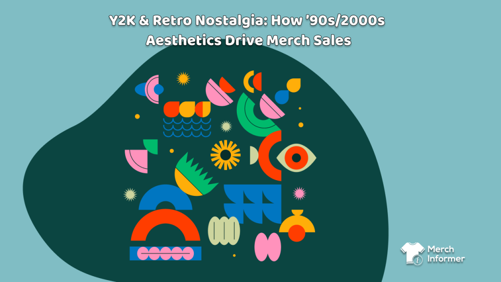
Y2K is back—but not as a gimmick. The late-’90s/early-’00s mix of bold geometry, pixel graphics, plastic-gloss textures, chrome gradients, neon, and grungy grain is the perfect recipe for merch that pops in thumbnails and delights IRL. 2026 design rundowns consistently call out pixels, simple shapes, retro/retrofuturist vibes, and textured grain as mainstream visual directions—exactly the ingredients of ’90s/2000s nostalgia.
At the same time, nostalgia and retro-futurism are explicitly flagged by major creative trend reports as rising forces in 2026—a tailwind you can ride with confidence. And beyond apparel and grips, posters and wall art are having a moment in home decor, with Y2K-leaning looks (neon, chrome, playful motifs) called out as surging—great news if you add posters to your mix.
Below is a design-heavy playbook you can hand to your team. We’ll keep Merch Informer mentions light—use it to validate keywords and timing—while we stay deep on what to design and how to make it sing on T-shirts, PopSockets, and posters.
1) Why Y2K aesthetics sell now
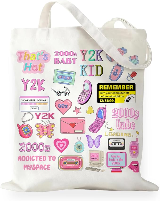
Nostalgia = identity. Shoppers buy a feeling—dial-up doodads, butterfly stickers, tribal barbed wire, vaporwave grids, CRT scanlines, candy-coated UI buttons. This palette of memories maps neatly onto merch canvases.
Thumbnails love contrast. Y2K’s high-contrast shapes, big type, and shiny gradients read instantly on small screens—exactly where discovery happens.
2026 validation. Pixels, geometric basics, and textured grain appear across this year’s design-trend rundowns; retro/retrofuturism is explicitly in the mix. That means the look is familiar yet fashionable, not niche.
2) The three pillars: geometry, pixels, vintage texture
A) Geometry (the readable backbone)
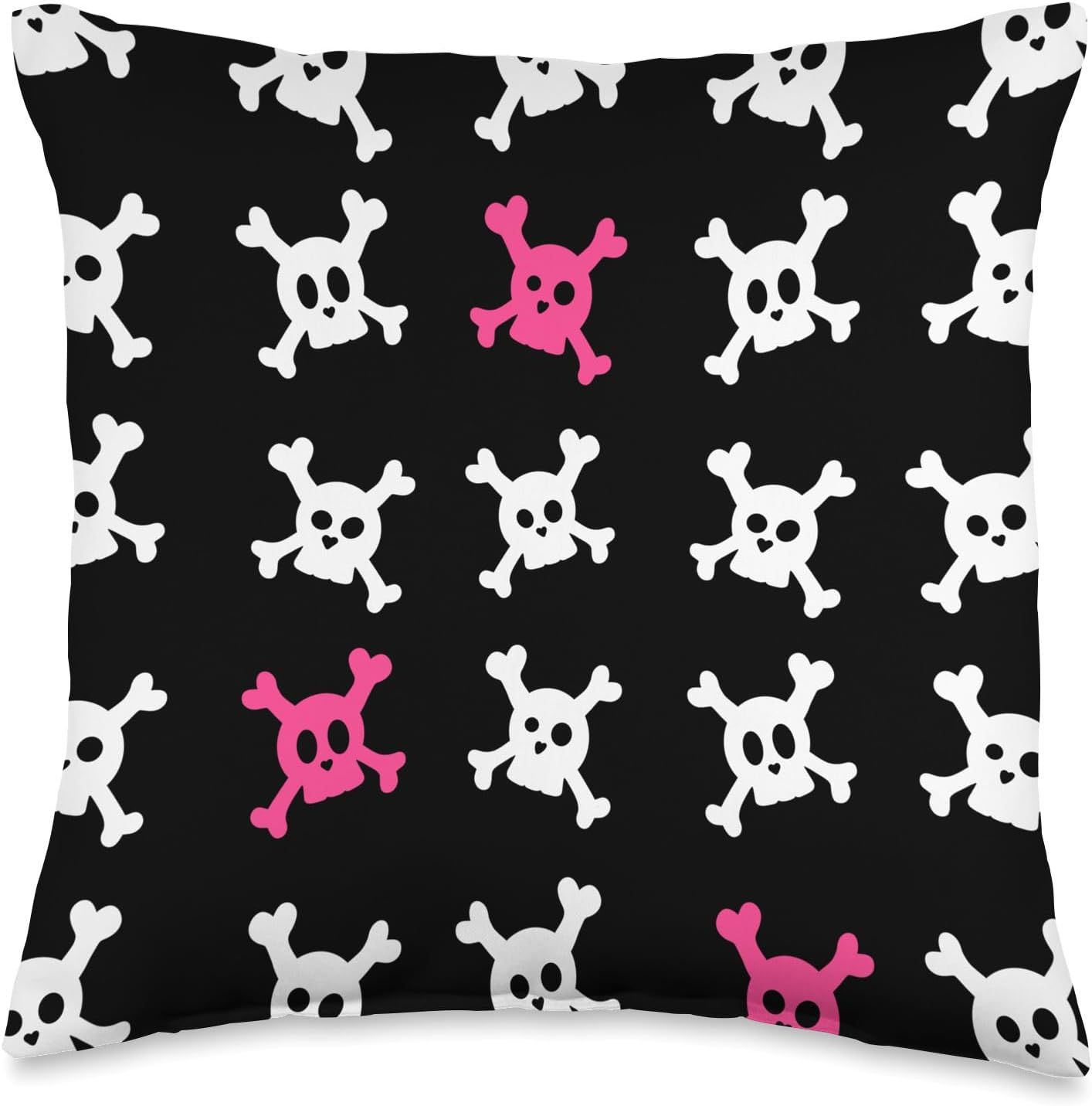
What it is: Primary shapes (circles, squares, triangles), rounded rectangles, checkerboards, chevrons, sunbursts, wireframes, isometric blocks.
Why it works: Clean geometry anchors the chaos—giving your art clear hierarchy and easy color blocking. “Simple geometry” appears among 2026 design trends—lean in. Looka
Design moves:
- Use one hero shape (e.g., oversized circle) and nest smaller counters (rings, dots, stars).
- Build grids and frames reminiscent of early GUI chrome: rounded corner boxes, pill buttons, segmented HUD lines.
- Add motion with diagonal stripes or radial rays (rave-flyer DNA) and finish with a thin “highlight ring.”
B) Pixel Art (identity + nostalgia, zero ambiguity)
What it is: Bitmap icons, 8-bit hearts, low-res sprites, blocky borders, pixel fonts.
Why it works: Pixels are inherently nostalgic and scalable. They read fast on small hardware like PopSockets, and 2026 trend lists literally call out “Pixels” as a headline design direction. Adobe
Design moves:
- Build iconography sets (hearts, smileys, butterflies, flames, aliens, n00b cursor arrows).
- Pair bitmap headlines with a smooth secondary font for contrast.
- Keep sprites at whole-pixel scaling to avoid blur.
C) Vintage Texture (make digital feel tangible)
What it is: Film grain, photocopier noise, halftone dots, paper fold lines, light leaks, faux anodized chrome, iridescent plastic.
Why it works: Texture adds warmth and tactility. “Textured grains” are specifically named among 2026 graphic design trends. Adobe
Design moves:
- Add 1–3% noise to gradients to kill banding.
- Use soft inner shadows on shapes for faux-plastic depth.
- Keep grime controlled (don’t muddy your palette); texture should enrich, not obscure.
3) Color systems: palettes that scream Y2K—in a good way
- Cyber Candy: neon magenta, electric cyan, toxic green, deep black. (Pairs with chrome accents.)
- Chrome Pastel: baby blue, lilac, mint, blush, plus silver-illusion highlights.
- Primary Pop: bold red/yellow/blue done in flat blocks—a bright direction aligned with “playful primaries” on 2026 moodboards. Pinterest
- Infra Sunset: hot pink → orange → yellow gradients with subtle grain.
- Vapor Grid: midnight navy foundation with grids in aqua/purple.
Pro tip: build one global swatch set per capsule to keep T-shirts, PopSockets, and posters coherent.
4) Typography: fonts that fit (and stay legible)
- Techno Sans / Eurostile-ish for HUD and label energy.
- Bitmap/Pixel fonts for headlines, paired with a clean grotesk for body.
- Stencil/Outline for poster-flyer throwbacks.
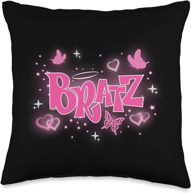
- Squircular scripts for “girly Y2K” looks (hearts, butterflies).
Keep strokes thick for shirts and extra bold for PopSockets. Watch licensing—use commercial-safe families or self-drawn bitmap sets.
5) Canvas-by-canvas tactics
T-Shirts (your statement surface)
- One clear hero: a chunky geometric emblem or big pixel icon.
- Place high contrast on top of dark shirts for thumbnail punch.
- Avoid micro-details; keep lines thicker than you think.
- Build series logic (e.g., “Chrome Hearts” capsule: heart, star, flame—same grid, different icon).
PopSockets (micro canvas, maximum clarity)
- Treat the circle like a coin or badge—no hairline borders.
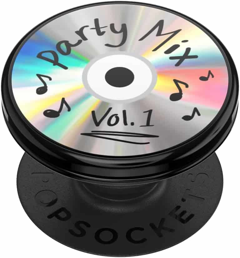
- Pixel hearts, smileys, cursors, mini checker tiles, chrome-orb gloss.
- Invert case/PopGrip colors (dark vs light) to show deliberate pairing.
Posters (the 2026 sleeper hit)
- Y2K/retro-urban neon and collage looks are resonating in home décor and wall art this year—great for dorms, studios, and streamer backdrops. AP News+1
- Design like a club flyer: stacked type, framed boxes, gridded stickers, barcode motifs; or go pixel collage with giant bitmap icons.
- Offer size tiers and texture variants (clean vs. grainy).
- Use a 2-sided series grid (Set A: “Neon Dreams,” Set B: “Retro System Error”) to encourage multi-buy.
6) Five capsule concepts you can ship now
- Chrome Cute
- Tee: puffy chrome heart with checker halo + grain.
- PopGrip: mini chrome heart on neon.
- Poster: heart/stars collage with bubbly UI buttons.
- Pixel Party
- Tee: 8-bit butterfly and cursors in primary blocks.
- PopGrip: pixel smiley badge, high-contrast inversion.
- Poster: tiled pixel stickers (hearts, flames, warnings).
- Grid Runner
- Tee: blueprint-style wireframe orb and sunburst.
- PopGrip: tight concentric rings + tiny grid.
- Poster: big isometric blocks, barcode footer, timecode.
- Rave Archive
- Tee: stacked condensed type, chevrons, hazard stripes.
- PopGrip: minimal rave icon (starburst) in a ring.
- Poster: faux photocopy texture, venue/date frames.
- Soft Neon Dream
- Tee: jelly-gradient butterfly with subtle sparkles.
- PopGrip: single star with iridescent glow.
- Poster: pastel gradient flood with tiny sticker panel.
7) Production cheat-sheet (save this)
- Templates & scale: build at final size; preview at 100%.
- Gradients: add 1–2% noise to avoid banding (posters especially).
- Color mode: sRGB; expect slight dulling of neon—compensate with contrast.
- File hygiene: transparent PNG for shirts/PopSockets; poster files per vendor spec.
- Edge behavior: keep focal elements away from case cutouts/edges; no hairline rings on PopSockets.
- Consistency: name files with capsule+variant (e.g., y2k_chromecute_heart_tee.png, …_pop.png, …_posterA.png).
8) Light-touch research with Merch Informer (keep it creative)
Use MI to validate language and timing, not drive the art:
- Keywords to map: “Y2K shirt,” “retro 2000s shirt,” “pixel art shirt,” “vaporwave poster,” “Y2K PopSocket,” “neon chrome poster,” “checkerboard tee.”
- Seasonality: posters spike around back-to-school and dorm refreshes; bright wall art is trending in 2026 (neon/city-glow side of decor). AP News
- Palette words: “neon,” “chrome,” “holographic,” “pastel,” “primary” help capture search intent.
- Pairing niche: scan competition for coordinated case + PopGrip + poster sets—still under-served.
9) Common mistakes (and fast fixes)
- Over-complexity on small canvases.
Fix: For PopSockets, reduce to one icon + ring; for tees, one hero + one support element. - Muddy gradients.
Fix: Increase value contrast; limit each gradient to 2–3 stops + add noise. - Random nostalgia soup.
Fix: Choose a system (geometry grid + 3 motifs) and repeat; don’t mix every trope at once. - Illegible pixel art.
Fix: Keep sprites at whole-pixel multiples; avoid fractional scaling. - Poster clutter.
Fix: Use frame modules—top title band, grid mid-field, utility footer.
Wrap-up
Y2K isn’t a fad; it’s a toolkit. Use geometry for structure, pixels for personality, and texture to keep it human. Build tight color systems, pick bold type, and translate the same capsule across T-shirts (statement), PopSockets (badge), and posters (environment). Validate keywords with Merch Informer, time your poster drops around dorm/back-to-school and decor refresh cycles, and stay disciplined: one hero, one support, maximum clarity.