Classic Pattern Throwback: Polka Dot & Buffalo Check Hoodie & Tote Interface Design
History, culture, and practical design systems for Merch by Amazon creators
Some patterns never quit. Two that reliably cycle back—especially in fall/winter—are polka dots and buffalo check. They’re bold, simple, and remixable. More importantly for Merch by Amazon, they read at thumbnail size and translate cleanly to cozy hoodies and everyday totes.
This guide blends just enough design history to give your work credibility, with practical “interface” systems so your art looks intentional on real products (not like a pattern slapped on a rectangle). Tool talk stays light—use Merch Informer to validate phrases/seasonality, then design with confidence.
1) Why these patterns sell
- Instant recognition: dots and checks are visual “alphabets”—fast reads on small screens.
- Mood control: scale and color flips can swing dots from playful to luxe, and checks from rustic to street.
- Seasonal gravity: buffalo check screams cabin/holiday; polka dots can go mod, romantic, minimalist, or pop—perfect for gifting.
- Collection logic: one dot tile + one check tile can power dozens of coordinated SKUs.
2) Pattern 101: what you’re actually building
Polka dots = repeat structure + spacing math
- Grid or offset (brick) repeat.
- Your “voice knobs”: dot diameter, spacing, and contrast. Tight = energetic; airy = elegant.
Buffalo check = value math on a grid
- Two base colors, plus a darker “overlap” value that makes the check feel dimensional.
- Your “voice knobs”: square size, contrast, and color swaps (forest/cream, oxblood/black, grayscale, etc.).
3) A quick cultural lens (useful for moodboards + listing tone)
Polka dots carry “graphic play” energy—think mod posters, retro fashion, pop-art printing, and modern art installations.
Buffalo check carries “heritage utility” energy—workwear, outdoors, cabin coziness, and winter retail cycles.

You don’t need to name-drop brands in listings. Just use the vibe words: “mod-inspired,” “heritage check,” “cabin-core,” “clean graphic dots.”
4) Color strategy: tune the mood without rebuilding the art
Dots:
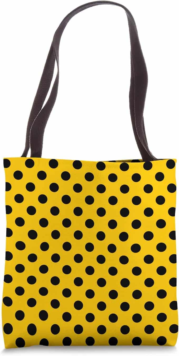
- Mod primaries: black/white + one bright (red/cobalt)
- Quiet luxe: bone + graphite + champagne accent
- Pastel sweet: blush/lilac/mint for softer totes
- Neon hit: cyan/magenta on black for Y2K edge
Buffalo check:
- Classic: red/black
- Modern lodge: forest/cream
- Moody street: oxblood/black
- Urban: grayscale
- Holiday swap: deep green/black (still reads “check”)
Tip: when you flip colorways, hold value contrast steady so readability survives different garments and lighting.
5) Scale: the difference between “premium” and “costume”
Think in viewing distance and print area, not just inches.
Hoodie chest print (not all-over):
- Dots: avoid micro-dots (fleece eats detail). Avoid huge dots (costume vibe). Aim for dots that visually balance your headline stroke weight.
- Check: you generally want 1–3 clear squares spanning across a headline or icon area. If it blurs into “texture,” scale up.
Tote face:
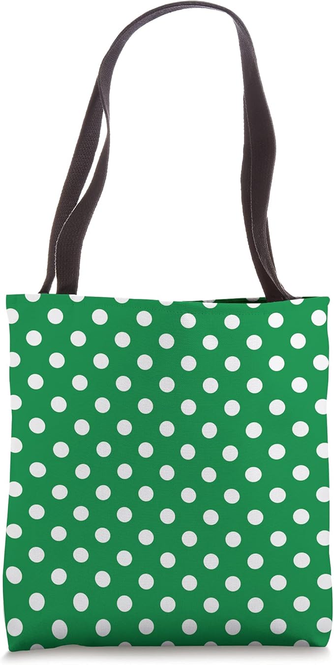
- Dots can go smaller than hoodies because canvas reads crisp.
- Check looks best when the squares align cleanly with borders and leave a confident margin.
Fast method: mock three scales (small/medium/large) and pick what reads best at arm’s length.
6) Hoodie interface design (MBA reality check)
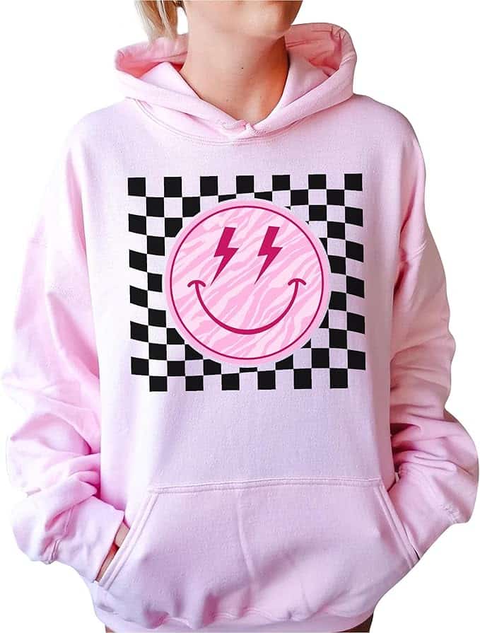
Merch by Amazon hoodies/crewnecks are front-print area products, not true all-over prints. So treat pattern as a controlled panel, not “fabric.”
Compositions that read premium:
- Pattern-fill headline
Big word (WEEKEND / COZY / OUTDOORS) filled with dots/check, outlined for contrast. - Badge + field
Circle/shield badge with pattern inside the badge only; outside stays solid. - Stacked bars
Three horizontal bars: solid / pattern / solid. Add a tiny subline—done. - Ghosted panel (giftable)
Low-contrast dots behind a simple emblem. Subtle = upscale.
Placement + print-proof tips:
- Keep art comfortably above the pocket seam.
- Avoid hairline outlines; fleece swallows thin strokes.
- Use shared swatches so pattern fill matches any icons perfectly.
Type pairing:
- Dots love geometric sans and simple scripts (used sparingly).
- Check loves slabs, varsity, condensed grotesks.
- One display + one support face max.
7) Tote interface design (treat it like a poster)
Totes are public and graphic. Give them margins and geometry.
Layouts that always work:
- Framed pattern panel
Centered rectangle of dots/check + a label badge overlapping the bottom edge. - All-pattern + patch
Fill the printable area with a small dot field, then lay a solid patch (circle/rounded square) with your icon/word. - Grid list
4–6 “coins” (dot circles or mini check badges) in a grid—each with a small icon (mug, book, leaf, paw, etc.). - Diagonal band
Check sash corner-to-corner with a bold word inside; the rest stays clean.
Edge discipline:
- Maintain a consistent margin so nothing feels “accidentally cropped.”
- Align check edges to borders—avoid random half-squares unless intentionally cropped.
8) Pattern mechanics: tiles you can trust
Dot tile checklist:
- Square artboard, grid or offset repeat.
- Export seamless tile; test with a 3×3 duplication.
- Keep edges crisp—avoid fractional pixels.
Buffalo check tile checklist:
- Create three swatches: Color A, Color B, Overlap.
- Build the grid so overlap happens consistently.
- Test multiple scales to avoid screen moiré.
Pro move: save tiles as reusable assets (symbols/smart objects) so you can clip them into type/badges fast.
9) Capsules you can ship ASAP
- Mod Dot Workshop
Hoodie: pattern-fill headline + stacked bars (black/white + one bright).
Tote: framed dot panel + patch badge.
Copy vibe: clean mod graphic energy. - Cabin Check
Hoodie: varsity or slab headline with check fill + tiny pine icon.
Tote: check panel + “stitched label” illusion.
Copy vibe: heritage, cozy, winter-ready. - Pop-Dot Studio
Hoodie: outlined type over a big, sparse dot field (legible).
Tote: grid of dot coins with mini icons.
Copy vibe: pop-art style dots without clutter. - Evergreen Plaid
Hoodie: condensed word with forest/cream check fill, moody outline.
Tote: diagonal band + crisp winter word (READ / HIKE / COZY).
Copy vibe: modern lodge. - Black & Bone Minimal
Hoodie: airy bone dots on black + tiny lowercase word.
Tote: bone field + micro dot grid + ultra-clean badge.
Copy vibe: quiet luxury, giftable.
10) Copy blocks you can paste
Hoodie (check-fill headline):
A classic buffalo check reimagined inside bold typography. High contrast and clean structure make it read instantly—cozy cabin energy for everyday wear.
Tote (framed dot panel):
Graphic polka dots in a clean, modern frame with a minimal patch badge. Built for daily carry with a crisp, poster-like layout.
Universal bullets:
- Original pattern artwork (no stock textures).
- Designed for thumbnail clarity and real-world legibility.
- Seasonal colorways that coordinate across SKUs.
- Clean margins and bold structure for hoodies and totes.
Wrap-up
Polka dots and buffalo check win because they’re legible, graphic, and endlessly styleable. On Merch by Amazon, don’t fake all-over printing—use patterns as fills, panels, badges, bars, and bands. Keep scale readable, color systems tight, and tiles reusable, and you can build a coordinated winter drop fast: one dot capsule for playful graphics and one check capsule for cozy heritage vibes.