Midwest Small-Town Pride Apparel: Cheese, Ranch Style & Solar Farms
Design-forward strategies for T-shirts & tote bags (for Merch by Amazon creators)
“State pride” is broad. Small-town pride is personal: the water tower mascot, grain elevators on the skyline, Friday night lights, potluck jokes, and backroads you can name from memory. Across the Midwest, the visual cues are instantly readable—dairy culture, ranch life + ranch-dressing humor, and the new rural skyline of solar farms. That’s a sweet spot for Merch by Amazon: bold icons, friendly type, and designs that read fast at thumbnail size.
Use Merch Informer lightly: confirm phrases, seasonality, and which wording buyers actually use—then spend your time building cohesive capsules.
1) Why Midwest small-town pride converts
- Hyperlocal identity: not “I’m from Wisconsin,” but “I’m from the town with the silos and the fish fry.”
- Giftability: reunions, homecomings, teacher gifts, holiday trips “back home.”
- Icon clarity: barns, water towers, road-sign shapes, dairy motifs, solar panel rows = clean silhouettes.
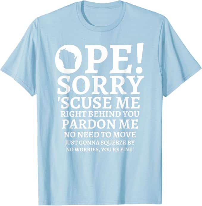
- Friendly humor: inclusive, office-safe jokes (“pop not soda,” “ope—lemme squeeze past ya,” ranch-on-everything).
2) Three capsule anchors you can build a whole quarter on
A) Dairy & Cheese Culture (Wisconsin + neighbors)
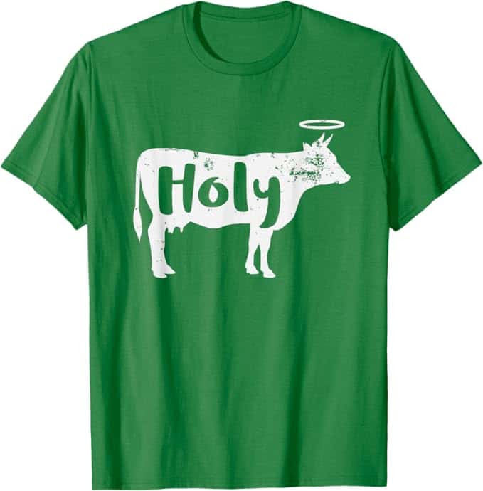
Icons: cheese wedge, curds basket, cowbell, milk bottle, Holstein-spot pattern, “squeak” badge.
Type: slab serif, collegiate, diner-style block lettering (keep it readable).
Palette: cheddar yellow, cream, barn red, pasture green, asphalt gray.
Phrase ideas (safe, generic):

- Curd Nerd / Curd Crew / Squeak Squad
- Friday Fish Fry + Curds
- Dairy State of Mind
- Big Cheese, Small Town
Trademark note: terms like “cheesehead” can have commercial associations—do a current trademark check before leaning on it. Easy alternates: Curd Crew, Cheddar Champs, Dairy State, Curd Nerd.
B) Ranch Style (two tracks)
1) Ranch life (Great Plains / rural Midwest):
Icons: barn silhouette, silo, windmill, tractor/combine, rope border, boot print, fence post.
Type: woodblock/slab, “heritage utility” (western-adjacent without cosplay).
Phrases: Raised on Backroads / Fence Posts & Sunsets / Silo Skyline Club / County Roads Regular.
2) Ranch dressing humor (condiment culture):
Icons: bottle outline, ramekin swirl, pizza slice dip, carrot/celery, label badge.
Type: rounded sans + label caps (stickerboard energy).
Palette: off-white, parsley green, pepper-speck gray, picnic-red accents.
Phrases: Ranch Goals / Dip Happens / Dress Code: Ranch / Dear Salad, You’re Welcome.
Compliance tip: avoid restaurant names and dressing brands. Keep it original.
C) Solar Farms (modern rural pride)
Icons: sun disc over tilted panel rows, barn + panel array, plug + leaf, simplified meter/kWh badge.
Type: condensed grotesk + clean numerals (utility sign vibe).
Palette: sky blue, corn yellow, panel blue-gray, grass green, graphite.
Phrases: Harvesting Sunshine / Corn, Soy & kWh / Rural. Renewable. Reliable. / Kilowatts & County Roads.
3) Tight Midwest color systems (3–5 swatches)
Keep palettes small so your storefront looks curated:
- County Fair: barn red, cream, denim blue, popcorn yellow
- Pasture & Silo: pasture green, milk white, silo gray, sky blue
- Road & Rail: asphalt, line-paint yellow, stop-sign red, reflective white
- Modern Rural: graphite, panel blue, soft sage, bone
4) Texture + pattern (use as panels, not wallpaper)
- Flannel/gingham as a fill behind type (not everywhere).
- Holstein spots as abstract shapes (subtle background).
- Woodgrain/plywood stamp for farm-supply vibes.
- Light halftone or 1–2% grain to warm up poster-style layouts.
- Road-sign shapes: rounded rectangles, chevrons, “route badge” silhouettes.
5) Typography pairings that sell the vibe fast
- Slab serif + tiny script (dairy diner): bold headline + “since forever” wink.
- Condensed grotesk + neat numerals (solar utility): CO-OP label energy.
- Varsity/collegiate (Friday nights): jersey-style numbers for area code/zip.
- Rounded sans + label caps (ranch jokes): pill badges, sticker feel.
Rule: one display + one support font. Keep strokes thick enough to hold up on apparel.
6) Build one icon library and reuse it everywhere
Standardize stroke weights (2–3 max) and export as SVG.
Core set: water tower, grain elevator, silo, barn, windmill, Main St banner, railroad crossing X, corn ear, soybean leaf, wheat head, milk bottle, cheese wedge, curds basket, rope loop, boot print, solar panel row, sun disc, plug/leaf.
7) Tees vs totes: what layouts win
T-shirts (identity statement):
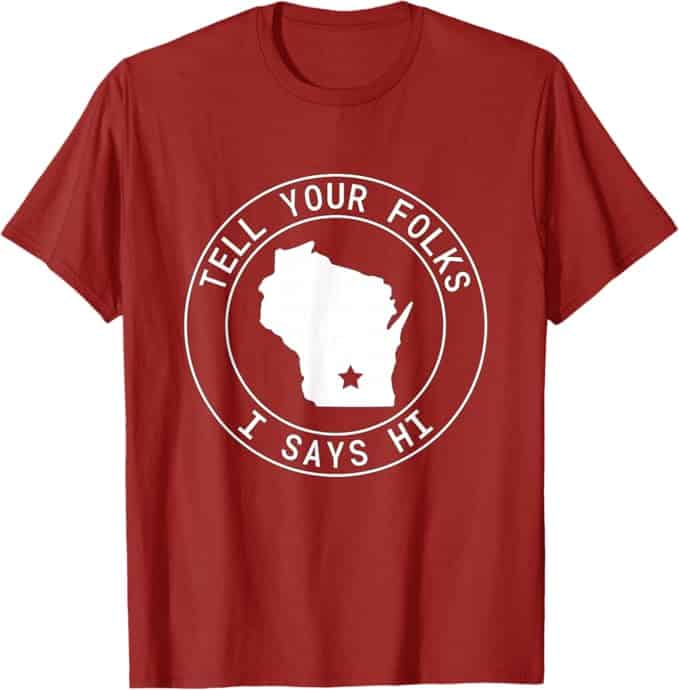
- Badge + Field (circle/shield + small subline)
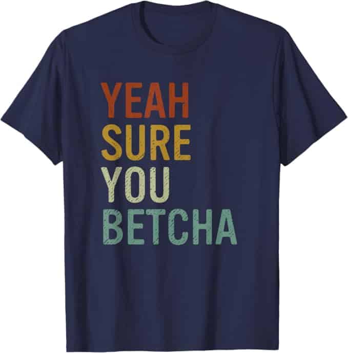
- Pattern-fill headline (SMALL TOWN filled with flannel/Holstein)
- Stacked poster (3 lines + icon row)
- Ribbon + coordinates/area code (generic)
Totes (public accessory):
- Framed panel (centered rectangle + label badge)
- Checklist grid (4–6 icons: Curds / Backroads / Bonfires / Ball Games…)
- Utility label (COUNTY SOLAR CO-OP style ticket)
- Diagonal band (rope or road stripe + one strong word)
Keep margins clean; avoid accidental edge-kissing.
8) Six launch-ready capsule concepts
- Curd Crew (Dairy)
Tee: CURD CREW + cheese wedge; subline “Squeak Approved.”
Tote: Holstein panel + “Local Dairy Dept.” badge. - Ranch Goals (Dressing humor)
Tee: RANCH GOALS pill label + ramekin icon.
Tote: checklist “Pizza / Fries / Carrots / Wings / Everything” + “✓ All of the above.” - Fencepost & Backroads (Ranch life)
Tee: BACKROADS with rope outline; “County ____” blank-style line.
Tote: diagonal rope band + boot print + tiny “Dusty Since 19—”. - Corn, Soy & kWh (Solar)
Tee: HARVESTING SUNSHINE + barn/panels silhouette.
Tote: CO-OP utility label + small “capacity/proud” style note (generic). - Water Tower Club (Town skyline)
Tee: big water-tower icon + banner (“POP. FRIENDLY.”).
Tote: skyline strip (elevator + silo + tower) + “Main & Maple” vibe label. - Weekend Traditions (Fish fry + Friday nights)
Tee: HOMEFIELD in varsity type + stadium light icon.
Tote: two-panel “BLEACHERS” / “FISH FRY” with icons.
9) Phrase banks (generic, adult, non-branded)
Dairy: Curd Nerd / Squeak Squad / Dairy State of Mind / Extra Cheddar, Extra Friendly
Ranch life: Raised on Backroads / Gravel Road Graduate / Silo Skyline Society
Ranch jokes: Dip Happens / Dress Code: Ranch / Dear Salad, You’re Welcome
Solar: Harvesting Sunshine / Sun on the Farm / Panel by Panel, Proud
Small-town: Pop, Not Soda / Ope—Lemme Squeeze Past Ya / Main & Maple Regular
(Quick trademark check on anything that feels “too famous.”)
10) Light MI research (compass only)
Test keyword families like:
“small town shirt,” “midwest pride shirt,” “ranch dressing shirt,” “water tower shirt,” “solar farm shirt,” “midwest tote bag.”
Then track which wording converts (pop vs soda, co-op vs solar farm, county roads vs backroads) and align your titles/bullets accordingly.
11) Compliance & safety guardrails
- Avoid school/team names, mascots, “official” vibes, and municipal seals.
- No restaurant brands or food-chain references for ranch humor.
- Keep “Friday night” generic (no logos, no school identifiers).
- Original art only; no traced signage, labels, or “real town” emblems.
In Conclusion
Midwest small-town pride sells when it feels specific but still broadly relatable: curds, backroads, water towers, and solar rows—drawn as clean icons with tight palettes and friendly type. Build capsules, reuse a consistent icon library, and keep the humor kind and generic. Use Merch Informer to validate phrasing and timing, then let design clarity do the heavy lifting.