Fairycore & Cottagecore 2026: Floral & Rustic Styles for Adult T-Shirts & Totes
A design-heavy playbook for Merch by Amazon creators
Cottagecore brought gardens, gingham, and handmade romance. Fairycore added mushrooms, moths, and moonlit shimmer. Going into 2026, the most sellable twist is more grown-up: less cartoon-cute, more botanical, folkloric, and craft-forward—perfect for adult tees and totes where clarity, typography, and restraint do the work.
1) The aesthetic DNA (keep it adult)
- Cottagecore: quilts, herb gardens, field notes, domestic calm.
- Fairycore: forest-nocturne, spores, dew, gossamer wings, moons.
- Overlap: wildflowers, linen texture, botanical studies, mushrooms, moths, lace/ribbon borders.
Adult cues: engraved-style linework, moody greens, museum-label type hierarchy, fewer character faces, more herbarium energy.
2) 2026 color systems (4–6 swatches max)
Build tight palettes so your listings feel like a collection, not a grab bag.
- Moss Library: moss / sage / bone / charcoal / muted gold
- Midnight Conservatory: ink navy / deep spruce / bone / antique brass / hint of plum
- Hearth & Harvest: oatmeal / terracotta / russet / bottle green / wheat
- Wildflower Noir: charcoal / bone / thistle / olive / garnet
Keep saturation modest; win with value contrast (light vs dark) so art reads in thumbnails and from tote-distance.
3) Motif libraries (design like LEGO)
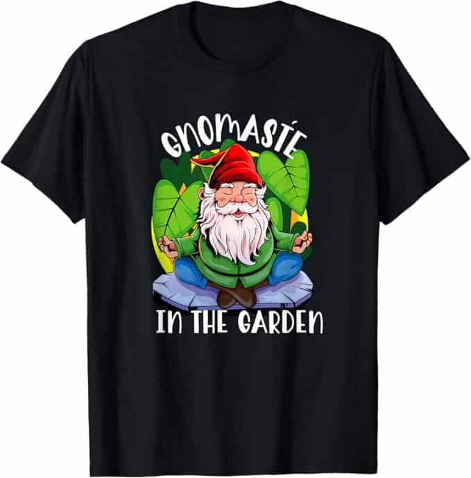
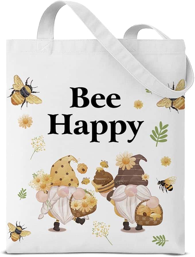
Cottagecore motifs: wild roses, daisies, lavender, chamomile, clover; lace scallops, embroidery sprigs, patchwork panels; baskets, honey jars, seed packets, “library card” layouts; bees and swallows.
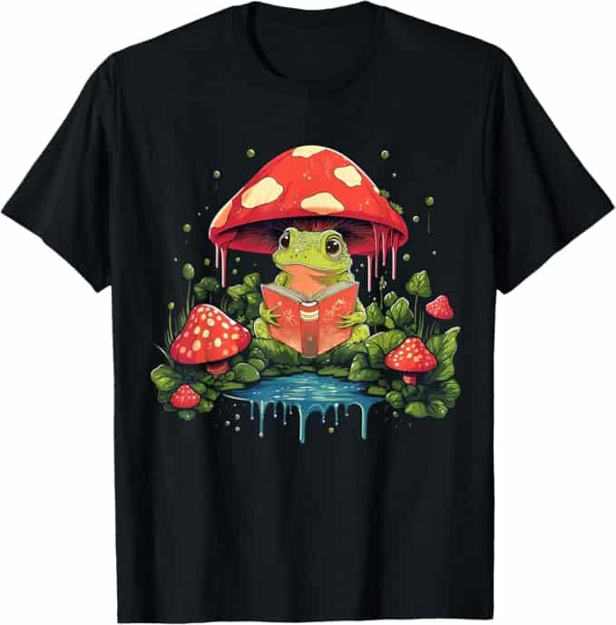
Fairycore motifs: toadstools, ferns, ivy; luna/atlas moths, fireflies, deer silhouettes; crescents and four-point sparkles; subtle “magic” cues like dewdrop highlights or glow rings.
“AdultIfy” the motifs: monochrome + one accent, etched/engraved linework, botanical labels, fewer “kawaii” signals.

4) Illustration & texture that feels crafted
- Engraved linework: consistent 1–2 stroke weights, light crosshatch
- Ink silhouettes: slightly imperfect edges + linen/paper grain
- Watercolor + ink outline: keep washes subtle; add tiny noise to avoid banding
- Embroidery illusion: stitch dashes + satin-fill shapes (no fake metallics)
- Patchwork as panels: framed blocks, not busy all-over fills
5) Type that reads like a field guide
- Heritage serif for headers (FIELD NOTES / HERBARIUM)
- Small caps + plate numbers for “museum label” texture
- Clean sans for subheads and tiny tables
- Script sparingly: one word only, with sturdy strokes
Rule: one display + one support font, then let spacing do the elegance.
6) Composition frameworks for adult tees
- Cameo Medallion: oval frame + moth/bouquet; curved headline; plate label
- Specimen Plate: plant + 2–3 detail callouts with figure numbers
- Badge + Field: centered coin badge; faint gingham strip or deckle texture
- Ribbon & Coordinates: ribbon headline over bouquet; tiny “Est. 2026” tag
- Nocturne Stack: moon → moth → mushroom ring; minimal type
Keep micro-text readable (avoid tiny labels that vanish at print scale).
7) Poster logic for totes
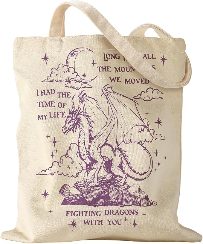
Totes read best when treated like prints:
- Framed panel with strong margins
- Apothecary label layout (header, icon, two calm lines)
- Coin grid (4–6 icons: bee/rose/moth/fern/teacup/mushroom)
- Diagonal sash (gingham/patch strip with bold serif phrase)
- Library card reinterpretation (tasteful, generic, not brand-referential)
8) “Night vs Day” (double output, same system)
Design once, recolor twice:
- Day: Hearth & Harvest / Moss Library (linen grain, bees, baskets)
- Night: Midnight Conservatory (moths, starbursts, luminous dots)
9) Phrase bank (adult, neutral, non-IP)
Use words as support, not the main event:
- Bread & Bloom
- Field Notes Society
- Wildflower Research Dept.
- Moss & Moonlight
- Moth Study Club
- Dewdrop Archive
- Plate No. VI — Woodland Study
- Archive of Gentle Things
Keep phrases descriptive; avoid anything that sounds like a brand, fandom, or “official” organization.
10) Six capsule concepts you can ship now
- Midnight Conservatory: moth cameo tee + apothecary-label tote
- Bread & Bloom: wheat + rose tee + rustic kitchen-object tote
- Herbarium Archive: specimen-plate tee + library-card tote
- Moss Club: minimalist “MOSS” + tiny fern coin; clean tote sash
- Patch & Petal: patchwork fill typography; framed quilt-panel tote
- Wildflower Noir: high-contrast engraved bouquet tee; coin-grid tote
11) Compliance & sensitivity (keep it safe)
- No medical, remedy, or foraging-safety claims.
- Keep folk cues generic; avoid sacred symbols.
- Use original art; don’t trace packaging or stock.
- Adult audience ≠ edgy; this niche sells calm.
In Conclusion
Fairycore/cottagecore is maturing—perfect for adult tees and totes. Build capsule collections with tight palettes, engraved linework, and field-guide typography. Treat tees like medallions or specimen plates; treat totes like posters or labels. Start with Midnight Conservatory + Bread & Bloom, recolor for Day/Night, and you’ve got a curated mini-drop that looks intentional—exactly what wins in 2026.