Best Design Practices On Amazon Merch On Demand: What Graphic Elements To Use For Each Category Of Merch
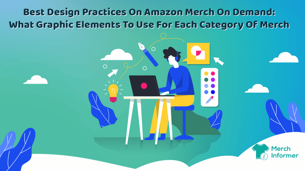
Design is ubiquitous – from the tiniest bubble gum wrapper to the car you wish to drive. And it’s even more important on Amazon Merch on Demand. Why? Because design plays a critical role in your merch sales.
After the optimization of your listing, it is what will ultimately catch your customers’ attention. So, are there some prevalent design principles that you need to follow for each category of merch? Our answer is a resounding “yes”.
Take a look below.
What are the best design practices when it comes to the different categories of merch on Merch by Amazon?
Designs for different categories of merch differ greatly. A design on a V-neck (which is mostly aimed at women) and designs on t-shirts (mostly aimed at men) are quite different indeed. From base color to a cursive or block font, to the size of the font, contrasting colors, as well as the actual design and niche.
So let’s explore these in more detail.
T-shirts
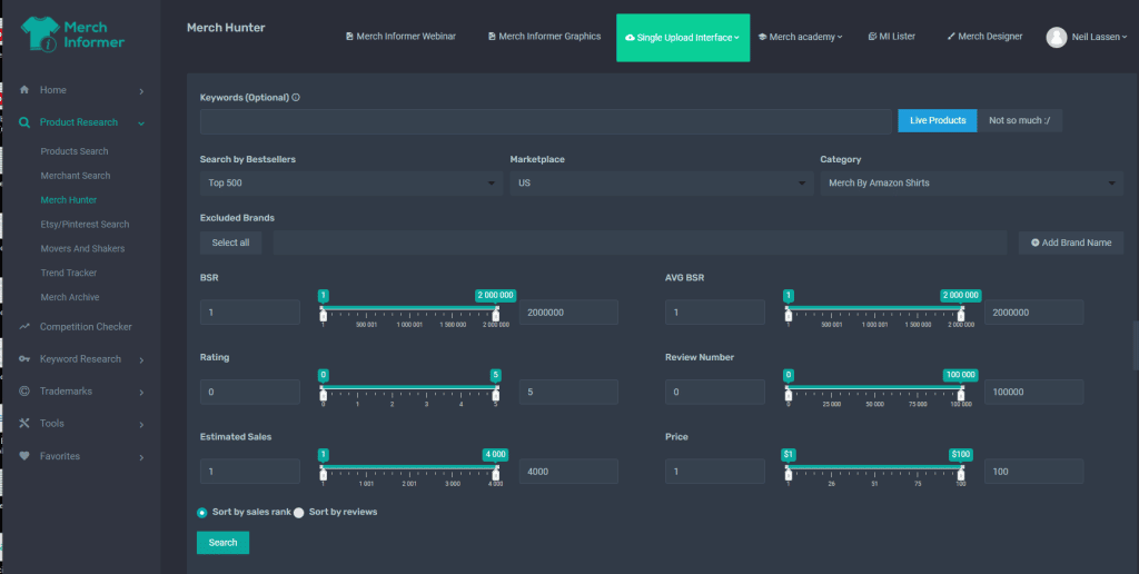
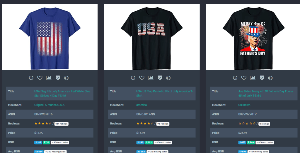
Perhaps because Father’s Day is approaching in the US, the Merch Hunter module on Merch Informer yields some best-sellers based on this special holiday. Excluding all trademarked names from the search, a couple of design imperatives emerge. Firstly, there are hardly any light or white-colored shirts in the top 500 results. They are predominantly black, which means this is the color you should aim for. Secondly, not all of the designs are actually design heavy. Instead, they feature a range of text that specifies the father’s day theme in a humorous way.
This is done by playing around with different font sizes and actual text from “I can’t. I have plans. In the garage” to “Reel cool dad” or “Pops. The man. The myth. The legend”. The font color is predominantly white on black, which is an important design principle because this creates a much stronger contrast. Other themes that emerge in the run up to the 4th of July include Independence Day shirts featuring the American flag. Despite this though, Father’s Day is dominating on Merch by Amazon at present and the simple fact that you can create shirts with minimal design using only different text and font sizes means you are ready to compete.
Excluding upcoming or past seasonal events, we can conclude that the prevalent design elements for t-shirts are black, or at the very least, dark backgrounds, little or minimalistic graphic elements, and an emphasis on text (preferably humorous).
Long sleeve t-shirts
The picture changes drastically when we conduct the same search for long sleeve shirts. There are no single themes emerging although there do appear to be some patriotic and politically-motivated long sleeve shirts being sold. The patriotic shirts are quite simple. They feature a rectangular design of the American flag in a vertical style and in relatively faded colors, perhaps going for a vintage look. The politically-motivated long sleeve shirts feature the words “Ukraine” and the Ukrainian flag. Simplicity is key here.
Other Sellers that are making waves in the long sleeve shirts category are those with personalized offerings. There’s a cute dog with the option to add the name of the shirt recipient in order to personalize it. This is found in the product titled “Personalized Cartoon Character t Shirts for Kids,Funny Mum Mother Shirt,Kids boy Long Sleeve Shirts Cartoon Characters (Character 1)”.
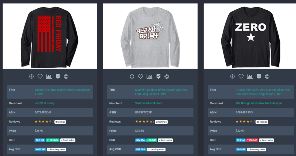
While most of the long sleeve shirts in the top 500 have a large and bold design front and center of the shirt itself, others have opted for a simple logo on the left hand side where the breast pocket would hypothetically be. Once again, the predominant colors are black although the font colors and designs here vary significantly from Seller to Seller, depending on the niche that is being pursued.
Sweatshirts
Sweatshirts present a different picture when it comes to the primary colors used. Apart from black, which is mainly used for t-shirts and long sleeve shirts, sweatshirts see a combination of black, navy blue, and gray. To make sure that colors stand out on top of this base color, merchants have aimed to create a strong contrast between the font and design colors and the base color of the sweatshirts. Gray sweatshirts, for example, are coupled with vivid red designs which are large in size that make for easier reading/recognition. Black designs are coupled with bright orange as well. This is a practice worth emulating if you want your design to stand out.
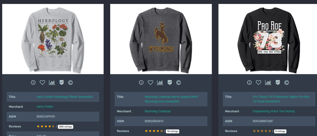
Interestingly enough, location names seem to be quite a favorite here. These include the Dominican Republic, Oklahoma, Detroit, Delaware, Georgia, Colorado, Cape Cod, Washington, Las Vegas, Austin, Boston, Tennessee, and others. Names of popular places are accompanied either by a rounded design or rectangular design that appears on the upper part of the sweatshirt with a large sized font that includes text and sometimes a mountain range or a particular geographical feature or landmark of that location.
Hoodies
The base color of most hoodies in the top 500 is black once again. While some of the top Sellers are actually trademarked names, other important features emerge among non-trademarked hoodies. These are the regular appearance of the American flag as a sign of patriotism (possibly owing to the run up to the 4th of July). There are also, once again, hoodies designed for dads in the run up to Father’s Day in the United States. The American flag is featured in a vertical mode and consists of a weathered look. Meanwhile, the Father’s Day designs are simple and feature white on black font text-only design with a square border around it.
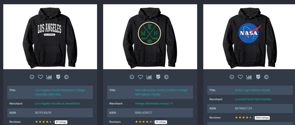
This means that you can not only anticipate important holidays as occasions for gift giving, but also that your design can be simple yet effective, despite the absence of actual drawing and items apart from text.
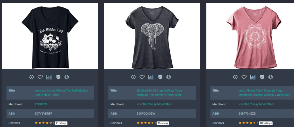
V-necks
Possibly because v-necks are mainly worn by women, we now see quite a big infiltration of pink items in the top 500 followed by black, navy blue, gray, and some smatterings of white. Some of the most popular designs range from complex mandalas to the well known peace sign. Others simply feature a name such as “Mimi” or “Nana” or text goes a bit further to say “Mother of the bride” or “Free Hugs”.
These words are not accompanied by any design whatsoever but they do use a mainly cursive instead of block font (in contrast to the Father’s Day shirts) and the font size is nowhere near as large as that presented on the dad shirts. Instead, the text is center-heavy and laid out at the top of the shirt in a horizontal manner making it easy to read.
Tank tops
The base colors for tank tops are predominantly black, followed by white, and then only one instance of navy blue in the top 500 results. Some predominant themes are Pride with rainbow-colored text. The dad theme emerges once again as does the 4th of July one with Joe Biden in an American flag top hat.
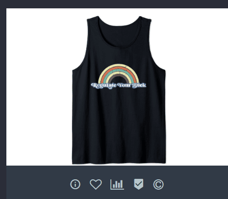
There are few design elements that can be narrowed down into a cohesive summary of design principles, except to mention once again that font colors and designs are usually chosen to contrast heavily with the base color of the tank top. The “Rad Dad” tank top, for example, uses vivid bold yellow across a black font with some rectangular design elements, although these would not necessarily be considered complex to emulate.
Our tips to help you improve your strategy
The world would be that much more bland if every design on Amazon Merch on Demand looked the same. This is where the beauty and variety of the platform come in. It enables Sellers to be as creative as they wish, juxtaposing various design elements together to create a unique piece of merch for sale.
As mentioned above, different categories of merch have varying designs. This makes sense, because clothing is a matter of expression. People who wear the final product – whether men, women, or youth – will expect certain things from the design.
However, if you’re too focused on your designs and don’t spend enough time and energy optimizing your listing, chances are that you simply won’t get in front of an audience, no matter how good the quality of your design is.
Hence, we suggest you apply the following principles in conjunction with your design strategy to ensure your listing gets the visibility it deserves:
Thorough keyword research
Do thorough research on keywords and apply high search volume keywords to your listings. Using Merch Informer can significantly help you with this.
Optimize titles and descriptions
Use the full (or as much as possible) space allocated for your titles and descriptions. Regarding descriptions, make sure to add who the product is ideal for, which occasion, which colors it’s available in, if there are any special instructions (such as personalization of the shirt) and try to squeeze in some high-volume keywords there, as well.
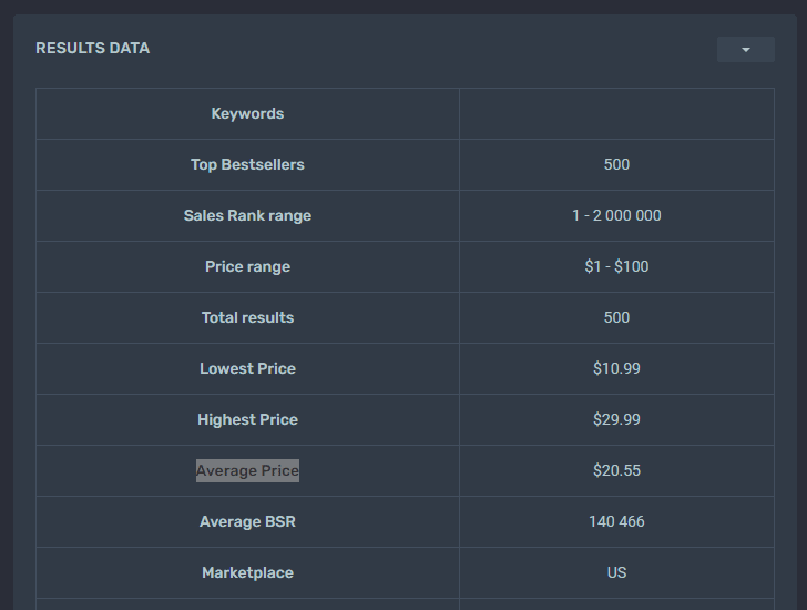
Price around the average
Price around the average of the best-sellers. This is going to guarantee that you find the golden pricing mean. You can always experiment with your prices later but the important thing is to scoop those customers away from competitors charging too much and those charging too little.
It’s also important to figure out what royalties you’ll get after each sale so that you can work out your profitability and see if the effort you’re putting in is worth your time.
Create unique designs
And finally, we come to the design. There are no hard and fast rules for design, except to plan them for a black base color as this is the most popular. Whether you use text-only or actual designs on your products, be sure to use contrasting colors. With text-only shirts, you’re likely to do well with white on black. Navy blue, on the other hand, can be well-paired with orange or yellow.
Don’t be afraid to experiment and play around with the color palette. Also tailor your fonts to the right audience. A woman’s item is likely to see more cursive fonts as opposed to men’s, which tend to feature large, block fonts. Therefore, knowing your audience is crucial, too.
In conclusion
The design on your Merch by Amazon product is one of the most important elements in your sales strategy. But it is not the only one. To be as effective as possible, you need to pair this with accurate and intelligent keyword usage, optimize your titles and descriptions, and also tailor your price to your customers’ budgets.
You need to look at design and listing optimization as different sides of the same coin. Without a cohesive strategy on both sides, you’re unlikely to be as successful as you could be. Therefore, with the help of Merch Informer, we urge you to check out your competition and see how they are positioning themselves so that you can not only emulate their best practices but improve upon their offering, too.