Product Pages That Convert: The POD Listing Elements Most People Skip
A POD listing can be “technically fine” and still fail to convert.
Why?
Because buyers don’t buy files. They buy certainty.
They need to feel:
- “This will look like the photo.”
- “This fits my person.”
- “This shop is legit.”
- “I know exactly what I’m getting.”
And if they don’t feel that certainty, they do what every online shopper does in 2026:

They back out, keep scrolling, and forget you existed.
That’s not a character flaw in the buyer. It’s normal. And it’s why conversion isn’t about hype or cleverness. It’s about removing anxiety from the purchase.
Think about how POD shopping feels from the buyer’s side. They’re buying something they can’t touch yet—often from a seller they’ve never met—based on a few photos and some words. Their brain is quietly running a safety checklist:
- Is this real?
- Is this going to arrive looking like the picture?
- Am I about to get burned?
- If it’s a gift, will I feel proud or embarrassed?
- If it’s for me, will it actually fit into my life?
A converting product page is simply a page that answers those questions fast.
Here are the most skipped conversion drivers—written the way a normal human can implement them without turning into an e-commerce robot.
First, a truth that saves time: “More traffic” isn’t always the solution
Most POD sellers assume the problem is traffic:
- “I just need more views.”
But often, the real issue is:
- you’re already getting the right eyes…
- but your page isn’t closing the trust loop.
If you fix conversion, your existing traffic becomes worth more.
That’s the best kind of growth because it doesn’t require more chaos.
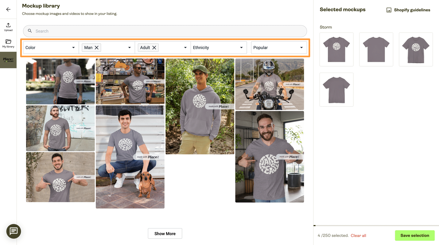
1) A clear first image that sells the vibe
Your first image should answer instantly:
- what is it?
- who is it for?
- what’s the vibe?
If it’s confusing at thumbnail size, it’s dead.
This is the number one place where “technically fine” listings fail. The product might be great, but the first image isn’t doing its job.
Because, on Etsy and Amazon-like marketplaces, the buyer doesn’t click because they’ve rationally evaluated your product.
They click because something in their brain says:
“Oh, that’s for me.”
Your first image needs to make that happen.
What makes a strong first image?
- The product is obvious (mug looks like a mug, tee looks like a tee).
- The design is readable at small size (no tiny text, no fussy details).
- The vibe is clear (minimalist, retro, cozy, spooky-cute, etc.).
- The image isn’t cluttered (no busy backgrounds that compete with the design).
A quick mental test
- Imagine your listing is one tile on a crowded screen.
- If the buyer can’t understand it in two seconds, it won’t convert.
- That sounds harsh, but it’s liberating: you now know what to improve.
2) A “gift sentence” in the copy
One line that tells the shopper where it fits:
- “Perfect teacher appreciation gift”
- “Great for book lovers”
- “Cozy fall decor vibe”
It removes decision fatigue. This is a conversion cheat code because it answers the buyer’s biggest silent question: “Is this the right kind of thing?”
Gift buying is especially anxious. People are terrified of picking something that feels cheap or random. Your gift sentence gives them permission to feel confident.
A strong gift sentence usually includes:
- the recipient identity (“teacher,” “nurse,” “dog mom”)
- the moment (“end of year,” “birthday,” “housewarming”)
- the emotional promise (“funny,” “thoughtful,” “cozy,” “classy”)
Example: “Perfect end-of-year teacher gift for the kind of educator who runs on coffee and sarcasm.”
That one line does a lot of work.
3) Clear expectations (what you’re printing, where, and how it may vary)
POD has limits. Don’t hide them.
Buyers reward clarity with trust.
This is where many sellers get nervous. They think:
“If I mention limitations, I’ll scare buyers away.”
The opposite is true.
What scares buyers away is surprise.
A buyer doesn’t mind reasonable reality:
- color may vary slightly from screen to print
- placement may vary slightly
- print texture differs by fabric/material
What they hate is feeling tricked.
So a converting listing makes expectations clear:
- What is the product, exactly?
- What areas are printed?
- What’s included?
- What can vary?
You’re not apologizing. You’re guiding.
Why this boosts conversion: because it makes the buyer feel like you’re a professional.
Professional = trustworthy.
Trustworthy = safe purchase.
4) A mini-collection feel (matching items)
Even if you’re not bundling, show:
- “also available as…”
- “matching set”
- “part of the ___ collection”
It increases browsing and AOV.
This is one of the most underused conversion drivers in POD because it turns a single listing into a doorway.
A buyer who likes your style often wants a second thing:
- a matching sticker
- a matching tote
- a matching mug
- a matching print set
But they won’t go hunting through 200 listings to find it. So you make the next step obvious.
This accomplishes two things at once:
- It increases average order value.
- It increases trust because the shop feels curated.
A collection signal tells the buyer: “This seller isn’t random. This is a real brand.”
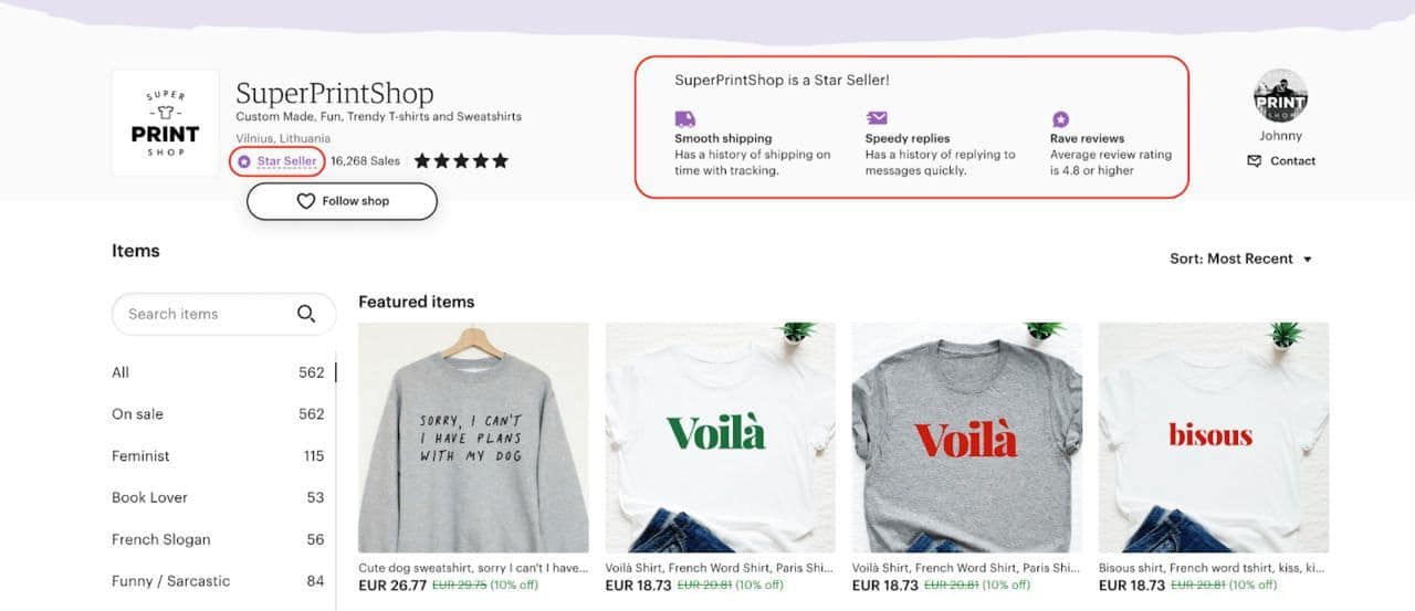
5) Consistent naming across listings
A shop that sounds organized feels higher quality.
This sounds small, but it’s huge.
Because shoppers don’t just read one listing. They often click a shop, scan a few items, and make a vibe judgment.
If your titles look like:
- “FUNNY MUG!!”
- “Teacher Gift Mug Coffee Quote”
- “Cute Teacher Mug Instant Download”
- “Teacher Shirt Great Gift For Teachers”
…it feels messy. And messy feels risky.
A simple naming system can make your shop feel premium overnight. Examples:
- “The Coffee & Chaos Collection”
- “Teacher Appreciation Series”
- “Minimal Mood Line”
- “Spooky-Cute Drop”
Even just consistent punctuation and structure helps.
The “Certainty Stack”: how to think like a converting product page
Here’s a simple stack that converts:
- Recognition (first image makes sense)
- Fit (gift sentence/ udience clarity)
- Trust (expectations are clear)
- Delight (mini-collection makes it feel special)
- Confidence (shop feels organized)
When all five are present, buyers stop hesitating. They buy.
A short story: why “technically fine” doesn’t win
Imagine a buyer shopping for a teacher gift. They search “teacher appreciation gift.” They see 30 mugs. Most of them are technically fine.
But, one listing jumps out because:
- the mug mockup is clean and readable
- the title is clear and not spammy
- the first line says, “Perfect end-of-year gift for teachers who deserve more coffee and fewer meetings.”
- the listing shows it also comes as a tote and a sticker
- the shop has consistent naming and looks curated
That buyer doesn’t need more comparison. They feel safe. They click “Add to cart.”
That’s what conversion is: the moment the buyer stops comparing and starts trusting.
Final thought
Conversion isn’t hype. It’s reducing uncertainty.
If you want your POD listings to sell more without doubling your workload, focus on the elements most people skip:
- a first image that communicates instantly
- one gift sentence that removes indecision
- honest expectations
- a mini-collection feel
- consistent naming that signals professionalism
Do those, and you won’t just get clicks.
You’ll get buyers who feel confident—and confidence is what converts.