The “Creator Catalog” Strategy: Building a Cohesive Brand Across Products
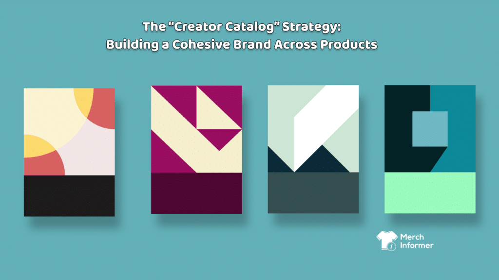
With more product options opening up across the print-on-demand ecosystem, it’s never been easier to list a lot of items. The harder—and more profitable—move is to build a catalog: a cohesive, recognizable body of products that feels like it comes from a real creator brand, not a random generator of listings.
That’s the difference between a shop that gets occasional hits… and a shop that builds repeat buyers.
Let’s talk about how the Creator Catalog strategy works, why it raises trust (and AOV), and how to build it without turning your workflow into chaos.
What a “creator catalog” actually is
A creator catalog is not “a bunch of designs.”

It’s a small universe with rules:
- a consistent niche focus (or a small set of related niches)
- a consistent aesthetic direction (your visual “handwriting”)
- consistent product choices (formats that make sense for your audience)
- consistent listing language (tone + naming system)
- consistent release rhythm (so it feels alive)
When buyers sense coherence, they assume:
- quality is consistent
- the creator knows what they’re doing
- the shop is trustworthy
On marketplaces, trust converts.
The core advantage: you stop competing as “a listing” and start competing as “a brand”
Most POD sellers compete at the listing level:
- this shirt vs that shirt
- this mug vs that mug
Catalog sellers compete at the identity level:
- “This shop is my vibe.”
- “This creator gets me.”
- “I want a matching set.”
- “I’ll follow them and come back.”
That’s why catalogs win over time. They create repeat behavior.
The 4 building blocks of a cohesive catalog
1) The Niche Spine
Pick a spine that can support multiple products without feeling random.
Examples of niche spines (broad enough to expand, narrow enough to be coherent):
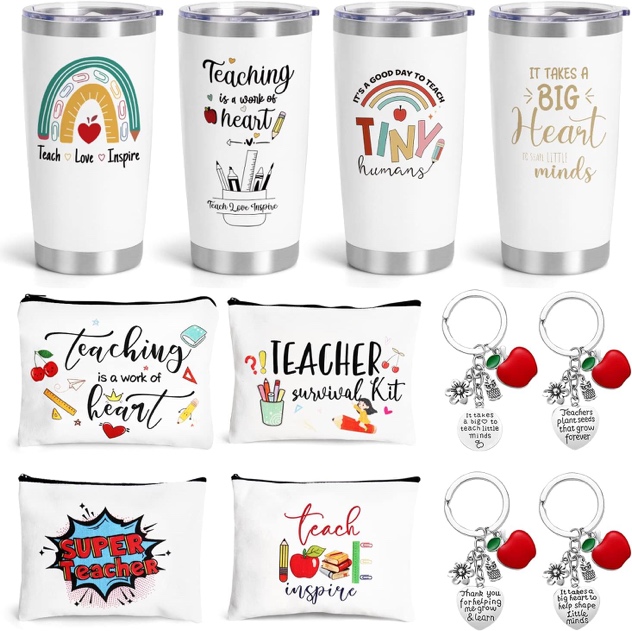
- teachers
- nurses
- book lovers
- dog parents
- campers/outdoors
- gardeners
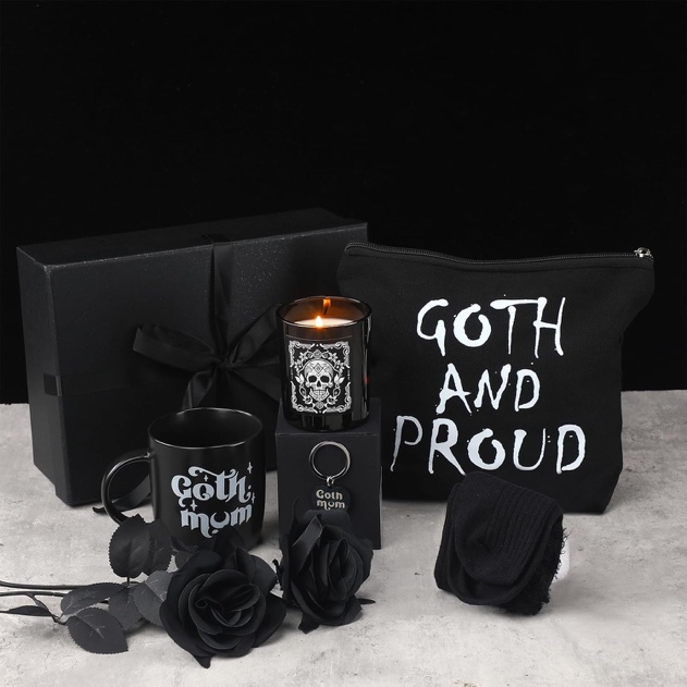
- horror fans (hi, my friend 😄)
- faith/inspirational (if that’s your lane)
- sports parent culture
Your spine is the “who.”
2) The Aesthetic System
Your aesthetic system is the “how it looks.”
This can be:
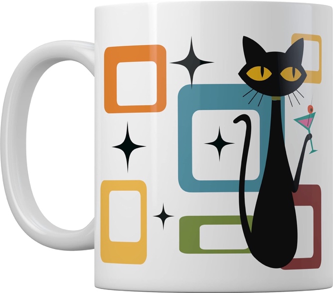
- retro diner
- minimal typography
- cute hand-drawn doodles
- vintage distressed
- bold modern block type
- cozy neutral palette
- spooky-cute
Your system should answer:
- What 2–3 fonts do you always return to?
- What kinds of icons show up repeatedly?
- What’s your palette logic (even if you change colors per design)?
Even if the sayings change, the visual handwriting stays consistent.
3) The Product Ladder
A catalog works best when it has a simple product ladder:
- Entry (low-friction): stickers, small prints, basic tees
- Giftable (easy add-on): mugs, totes, notebooks
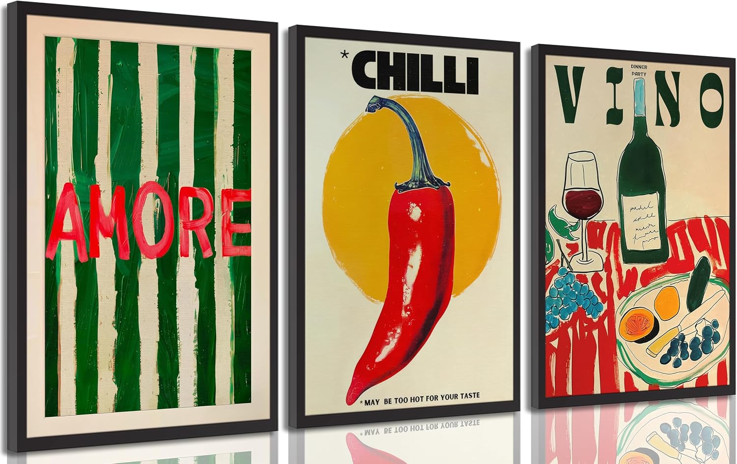
- Statement (higher value): hoodies, wall art sets, premium items
Not every brand needs every rung—but most do better when they have at least two.
A product ladder increases AOV naturally because it gives buyers an easy “and also.”
4) The Naming + Listing Language System
This part is overlooked—and it matters.
Catalog shops name things consistently:
- “The [Vibe] Collection”
- “The [Niche] Series”
- “Edition 01 / Edition 02”
- “Set A / Set B”
They also keep a consistent voice:
- cozy and encouraging
- dry and witty
- clean and modern
- cute and playful
Consistency creates the feeling of a brand even before a buyer clicks.
The “Catalog Loop”: a repeatable method to build 30 listings without losing your mind
Here’s the simplest repeatable loop:
- Pick 1 niche spine + 1 aesthetic system
- Create 3 core designs (your “pillars”)
- Adapt each core design to 3 product formats (9 listings)
- Create 3 variations per core design (tone/audience) (now you’re at ~18–27)
- Release in waves, keeping the winners and retiring the weak links
This prevents random sprawl.
It’s catalog growth with guardrails.
Why catalogs make the algorithm happy (without obsessing over it)
Most platforms reward signals that show:
- consistent engagement
- repeat clicks
- favorites/follows
- multiple item views per session
A cohesive catalog increases all of those because the buyer naturally browses within your world.
Even when the algorithm is a black box, buyer behavior isn’t:
- coherence keeps people in your shop longer
- longer sessions create more chances for conversion
Where Merch Informer fits (lightly, but powerfully)
Merch Informer is most useful here as a discipline tool:
- it helps you stay systematic instead of improvisational
- it helps you build a catalog that can scale across multiple product types and storefronts without multiplying admin pain
Think of it this way:
Catalog strategy is the creative decision-making.
A streamlined workflow is what makes the strategy survivable.
Quick self-check: does your shop feel like a catalog?
If you want to diagnose your current storefront, ask:
- Would a stranger understand what this shop is “about” in 10 seconds?
- Do listings look like they belong to the same creator?
- Do you have an obvious “collection” structure?
- Do you have natural add-ons (giftables) that match your hero items?
- Do your top 12 listings look like a line, not a garage sale?
If not, you don’t need new ideas. You need cohesion.
The payoff: AOV, repeat buyers, and less burnout
Catalog sellers usually experience:
- higher AOV (because sets and add-ons are natural)
- more returning customers
- less creative exhaustion (because you’re building within a system)
- a cleaner brand that can expand into new products without feeling random
It’s not just a strategy. It’s a way to scale without losing your identity.