Design Once, Version Many: Smart Variations That Don’t Feel Like Spam
One of the fastest ways to burn out in print on demand is trying to “scale” by brute force: more designs, more ideas, more uploads, more everything.
That approach works… right up until it doesn’t.
The creators who last—and who build catalogs that actually look professional—usually scale a different way:
They design systems, not one-offs.
They take one strong concept and create smart variations that feel intentional, collectible, and coherent… not like copy-paste spam with a different color slapped on.

This post is about how to do that—without becoming the person who uploads 47 near-identical listings and wonders why nothing converts.
Why variations work (when they’re done right)
Variations aren’t a shortcut. They’re a way of meeting real buyer behavior.
Because buyers don’t think in single listings. They think in:
- “This is my vibe.”
- “This fits my person.”
- “This is close, but I wish it said ____.”
- “I love this… but I want it more minimal / more loud / more cute.”
In other words: variations help you match preferences.
But only if those variations are meaningful.
The difference between “variation” and “spam”
Here’s the line in the snow:
Spam variation:
A change that doesn’t create a new buying reason.
- tiny wording swap with no audience difference
- random font swap with no aesthetic rationale
- 12 colorways dumped on the same phrase
- meaningless “new” versions that all compete with each other
Smart variation:
A change that targets a different buyer preference on purpose.
- different tone (sweet vs sarcastic)
- different aesthetic (minimal vs maximal)
- different relationship (mom vs dad vs teacher)
- different context (holiday vs everyday)
- different “use case” (gift vs identity vs decor)
Smart variation feels like a thoughtful collection. Spam variation feels like noise.

The four safest “variation lanes”
If you stick to these, you’ll scale cleanly and keep your brand reputation intact.
1) Audience variants
Same core design idea, aimed at adjacent audiences.
Example (generic):
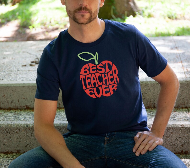
- “Best Dad Ever” → Dad / Grandpa / Stepdad / Bonus Dad / New Dad
- “Teacher life” → 1st grade / kindergarten / art teacher / music teacher
This is not spam. It’s relevance.
Rule: only do audience variants where the audience actually self-identifies with the label.
2) Tone variants
Same concept, different emotional flavor.
Think:
- wholesome / sweet
- dry / witty
- bold / hype
- calm / minimalist
- “cute-illustrated” vs “typographic”
Tone variants work because buyers are choosing identity—and tone is identity.
Rule: don’t mix tones randomly in one listing cluster. Group them into mini-collections.
3) Aesthetic variants
Same message, different style worlds.
Aesthetic is one of the biggest purchase drivers in POD, especially in giftable categories.
Examples of style worlds:
- retro / vintage
- modern minimal
- hand-drawn doodle
- bold block type
- “cozy” palette vibe
- spooky-cute
- dark academia
- bright kidcore
Rule: each aesthetic should feel like it belongs to a consistent brand lane—don’t whiplash the shopper.
4) Format variants
Same design concept adapted to different product formats because the buyer uses them differently.
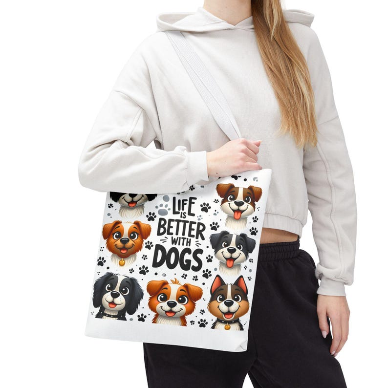
Shirt vs tote isn’t just “same design, different product.” It’s a different reason to buy.
- tote = visible lifestyle + no sizing
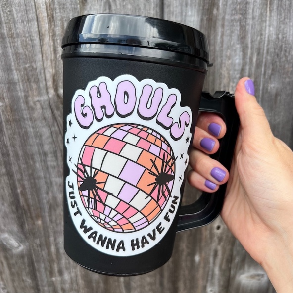
- mug = ritual + giftable
- sticker = impulse + bundle-friendly
- wall art = decor + aesthetic-first
- notebook = daily habit
Rule: when you change product format, adjust the design slightly so it “fits” the object (layout, readability, spacing).

A simple “Design System” that creates 12 listings from 1 idea (cleanly)
Here’s a sane, non-chaotic way to scale:
Step 1: Build one strong “core design”
One message. One visual direction. One clear niche.
Step 2: Choose one variation lane first
Pick one:
- audience OR tone OR aesthetic OR format
Don’t do all four at once. That’s where catalogs turn into spaghetti.
Step 3: Create a 3×4 structure
This is the sweet spot:
- 3 variations (example: 3 tones)
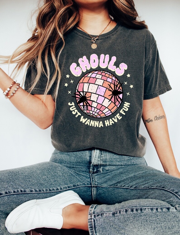
- across 4 formats (example: shirt, tote, mug, sticker)
or
- 4 audience labels
- across 3 aesthetics
Now you have 12 listings that feel curated instead of duplicated.
The “Collection Test”: how to know if your variations are legit
Before you publish a set of variations, ask:
- Could these sit together on a shelf and feel intentional?
- Does each version have a different buyer in mind?
- If I showed a customer two versions, would they have a real preference?
- Do any of these versions cannibalize each other? (too similar = compete)
- Does the collection tell one coherent story?
If you can say yes, you’re building a catalog—not a clutter pile.
Avoid the biggest variation mistake: “too many choices”
More choices can reduce sales.
If a shopper sees 30 versions, they often do nothing because decision fatigue kicks in.
Better strategy:
Release in waves.
- Wave 1: 6–10 variations
- Let winners emerge
- Wave 2: expand only on the winners
This keeps your shop feeling curated and alive instead of frantic.
The best reason to vary: you’re creating gift fit
A lot of POD purchases are gifts. Gift buying is basically matching:
personality + vibe + context
Variations help because the buyer can find the version that fits the recipient without hunting elsewhere.
This is why audience + tone variants are so powerful:
they create that “OMG this is perfect for her” moment.
Final thought: scaling doesn’t mean becoming noisier
Scaling means becoming more intentional.
If you design once and vary with purpose—audience, tone, aesthetic, or format—you get:
- more listings without more brainstorm exhaustion
- more chances to match a buyer’s taste
- a catalog that looks professional
- and a business that doesn’t make you hate your own store
That’s the real win: more output, less chaos, and variations that feel like a thoughtful collection—not spam.