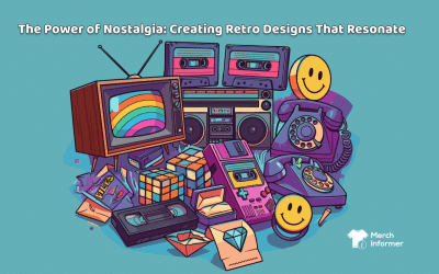
Choosing colors for your POD merch: What do the different colors mean and how do they affect your gig?
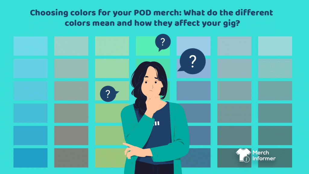
The world of print-on-demand (POD) merch offers endless creative possibilities. But one crucial aspect of designing top-performing products is choosing the right colors.
Why? Because different tones have a profound impact on our emotions, perceptions, and buying decisions.
In this article, we’ll explore the psychology of colors and how they can affect your POD gig on Amazon Merch on Demand.
Understanding color psychology
Whether you’re designing t-shirts, phone cases, or any other POD item, understanding the psychology behind colors is a powerful tool. It can help you create visually appealing and emotionally resonant products that connect with your target audience on a profound level.

Achieving this will ultimately unlock exciting opportunities and fruitful gains for you as an Amazon Merch on Demand seller.
So without further ado, let’s dive into the hidden meaning behind every shade.
Red: Passion and energy
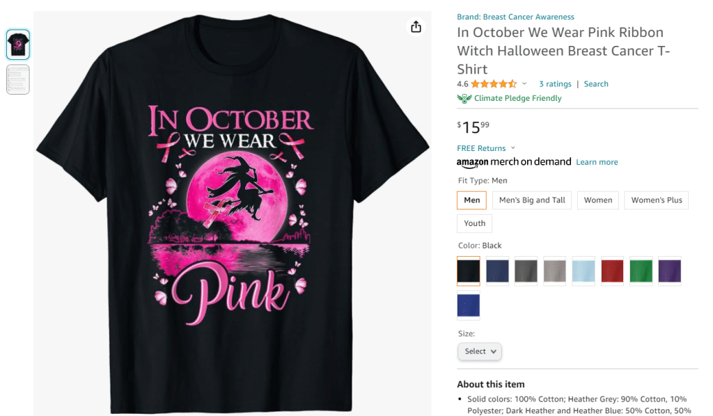
Red is well-known as the most powerful and attention-grabbing tone in the color palette. It’s associated with passion, love, and energy, often used to convey urgency.
But when should you embrace the fiery allure of red in your Amazon POD merch designs?
If your message is fervent, bold, or fearless, red resonates perfectly. As the universal color of love, it also naturally finds its place in merch tailored for romantic occasions and relationship-based products.
For example, some of the most successful Valentine’s Day t-shirt designs feature the color red.

Furthermore, red embodies the vigor and determination of athletes and fitness enthusiasts. If your merch is in the sports or wellness niche, red is a stellar choice.
In your quest to leverage the power of red, remember that balance is key. Intensity can be overwhelming if overused.
Therefore, always test your designs and seek feedback to ensure that this color enhances your merch’s message and appeal without overpowering it.
Blue: Trust and calm
Contrary to red, blue is on the other end of the spectrum. It’s often hailed as the color of calmness, tranquility, and trust.
Using blue in your POD merch means infusing your designs with a tranquil aura, assuring customers that your items are steadfast and trustworthy.
But blue isn’t just about conveying trust; it also creates a sense of professionalism.
If your designs revolve around dependability, competence, and a sense of order, blue is your ally.
As blue creates a peaceful and harmonious atmosphere, it’s suitable for niches connected to relaxation and well-being. The tone is also connected to clean air and water, making it a top choice for eco-conscious and health-related merch designs.
Green: Growth and nature
From the rainbow of hues, one particular color emerges as a symbol of nature, freshness, and vitality – green.
It’s a representation of life and renewal, often associated with the great outdoors. But apart from its nature-inspired essence, it’s also about creating harmony and promoting well-being.

If your design’s messaging promotes balance, health, and natural living, green is a must. It’s also perfect for merch linked to sustainability and eco-consciousness.
In terms of appropriate niches, green naturally fits with gardening, outdoor activities, and nature enthusiasts. It can also work well for designs promoting organic food and lifestyle.
Yellow: Optimism and happiness
If you’re looking for a shade that will scream optimism and energy, yellow is the right choice.
It’s the hue of bright sunflowers, cheerful smiles, and a zest for life. Incorporating yellow into your POD merch will allow you to bring your designs to life and create a sense of happiness, positivity, and a touch of creativity.
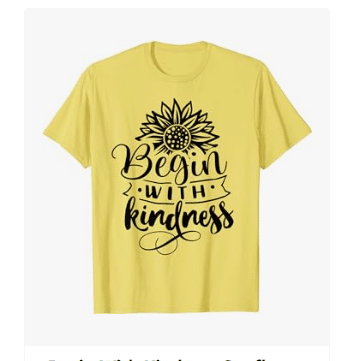
Although this color won’t perform well in every niche, there are specific segments where it works wonders. For example, yellow text or illustrations on merch designs tied to art, creativity, and self-expression can turn your listings into a success story.
This tone also suits designs targeted at children and families as its playful vibe resonates with younger audiences. You can also utilize it for creations promoting summer activities, outdoor adventures, or leisure.
Not to mention that yellow’s stimulating quality makes it suitable for educational and learning-related themes too.
Purple: Luxury and creativity
Purple stands out from the rest as a color that exudes elegance and creativity.
This tone can add a sense of refinement, creativity, and a hint of intrigue to your merch designs. It embodies the grandeur of royalty, hinting to your customers that your creations are extraordinary and polished to perfection.

For these reasons, purple is a common choice for niche markets linked to art, imagination, self-expression, and mysticism.
Black: Elegance and mystery
Black, in contrast, carries profound symbolism in the world of psychology and design. It is the embodiment of sophistication.
This deep, enigmatic shade signifies an aura of elegance, depth, and timeless style.
Often associated with classic attire and drama, black tells a story of intrigue and allure. It symbolizes the unknown, the uncharted, and the undiscovered.
At the same time, black makes a good base color as it’s a canvas of neutrality and versatility.
Naturally, black is a popular foundation choice in bestselling t-shirts and other merch types. It enables sellers to create a stunning contrast between imagery, text, and background.
Orange: Energy and enthusiasm
Orange sends a similar message to yellow but has its own peculiarities. This vibrant color promotes enthusiasm, creativity, and a sense of excitement.
It’s also the tone that is most often used to inspire energy and enthusiasm.
So what types of merch designs can you use it for?

Orange is a perfect fit for niches tied to youth, creativity, and innovation. It’s also a great way to attract the attention of adventure seekers, outdoor enthusiasts, and those who savor leisurely experiences.
As the tone signifies warmth and creativity, it’s also trendy in themes related to your home decor and living space.
What’s the best choice of color for your POD gig
Now that we’ve explored the meaning behind different tones, it’s time to discuss how to select the right ones for your merch designs.
We’ll also look at how hues influence your performance.
Seller identity
One of the key factors to consider when identifying appropriate colors for your merch is your seller identity.
When customers see your products in search results, they should recognize them instantly. Of course, the choice of shade isn’t the only factor here. Your font, messaging, and imagery will also make a difference.
But color consistency will make an impact.
For example, if you sell eco-friendly designs, a consistent use of green across your range reinforces your commitment to sustainability. It could, therefore, be a tipping point for your shoppers’ decision-making.
Target audience
Choosing the right colors for your merch based on your target audience is a strategic process that can make a significant impact on sales.
Begin by conducting thorough market research to understand your target audience. Identify their demographics (age, gender, and location) and psychographics (values, interests, and lifestyle).
Develop detailed buyer personas that represent different segments of your target audience. These personas should include information about their behavior, tastes, and color preferences.
Seasonal and trend considerations
When selecting the tones of your designs, there are also seasonal considerations to remember.
Your designs should reflect the time of year. For example, pastel colors are often associated with spring, while warm, earthy tones are popular in the fall.
Use shades that resonate with the current or upcoming season to make your products feel timely and relevant.
In addition, don’t forget that different colors also evoke the emotions and moods of a particular season. For instance, cool blues and greens can create a sense of calm and relaxation for summer, while warm reds and oranges can evoke coziness for winter.
Moreover, consider special occasions within each season, such as holidays or events like Valentine’s Day or Halloween. Adapting your merch colors to match these occasions can make your products more appealing to customers looking for themed items.
For instance, red and green are often used in Christmas designs, while orange is the must-have tone for Halloween merch.
In a nutshell
Overall, choosing the right shades for your POD merch involves a deep understanding of color psychology and your target audience.
By strategically selecting options that resonate with your seller identity, niche, and message you can create visually appealing products that not only look great but also bring in money.
Think carefully about the colors you select and make data-backed decisions using powerful business intelligence tools like Merch Informer.